
Business portrait clients are not buying a photo. They are buying a version of themselves they can hand to the world with confidence. When I first started taking corporate headshot bookings in Miami, I thought technical competence was enough. Clean background, decent light, sharp focus. Done. What I didn’t realize was that I was making the same five mistakes over and over, and my repeat booking rate showed it.
I came across this Watch the full tutorial on YouTube from Visual Education after a rough quarter where I was getting plenty of first-time headshot clients but almost no return business and no referrals. The creator, Carl Taylor, ran a live critique session with his membership community and pulled out the most common errors he kept seeing. Watching it, I counted at least three mistakes I was making regularly. Here is what the tutorial covers and how to actually apply it.
Step 1: Expose for the Face, Not the Frame
 Overlit shoulder competing with underexposed face in portrait
A correct overall exposure reading does not mean you have a correct portrait. This sounds obvious, but here is what actually happens: you nail your histogram, your whites are not blown, your shadows have detail, and you feel good about the image. But the face is sitting at the same brightness level as the subject’s shoulder or the background, and the viewer’s eye has no reason to land on the person first.
Overlit shoulder competing with underexposed face in portrait
A correct overall exposure reading does not mean you have a correct portrait. This sounds obvious, but here is what actually happens: you nail your histogram, your whites are not blown, your shadows have detail, and you feel good about the image. But the face is sitting at the same brightness level as the subject’s shoulder or the background, and the viewer’s eye has no reason to land on the person first.
In the example Carl critiques, the subject’s shoulder is significantly brighter than her face, which means the light wasn’t aimed where it mattered. The fix starts at capture: position your key light so the face receives the most light in the frame, and use a light meter or a test shot to confirm the face, not just the overall scene, is properly exposed. In post, use a radial gradient or targeted adjustment brush to selectively lift exposure on the face by 0.3 to 0.5 stops if needed, while pulling back any competing bright spots on clothing or background.
Step 2: Identify Your Hero Before You Shoot
 Cluttered background equipment overpowering the subject
Every strong portrait has a hierarchy: one subject who leads the image, and everything else that supports that lead without competing with it. Carl uses a film analogy that stuck with me, and I’ve actually started using it with clients when I explain my process. The person is the star. The props, the background, the context are the supporting cast. When the supporting cast gets more screen time than the hero, the whole thing falls apart.
Cluttered background equipment overpowering the subject
Every strong portrait has a hierarchy: one subject who leads the image, and everything else that supports that lead without competing with it. Carl uses a film analogy that stuck with me, and I’ve actually started using it with clients when I explain my process. The person is the star. The props, the background, the context are the supporting cast. When the supporting cast gets more screen time than the hero, the whole thing falls apart.
In one of the critiques, a piece of medical equipment in the background looks so prominent it pulls focus completely away from the subject. The practical fix at the shooting stage is to open your aperture to f/2.0 or f/2.8 to soften the background optically. If you’re working with a wider aperture isn’t possible for your setup, flag or reposition anything in the background that is visually complex, bright, or high-contrast. In post, Carl demonstrates darkening the background and brightening the subject as separate targeted adjustments. That contrast difference between hero and background is what trains the viewer’s eye where to go.
Step 3: Understand What Dodging and Burning Actually Do
 Dodging and burning applied to flatten competing tones in portrait
Dodging and burning is not a retouching technique. It is an attention-direction technique. The distinction matters because it changes why you use it. You are not just smoothing skin or fixing uneven light, you are literally drawing a map for the viewer’s eye, showing it where to travel through the image and what to ignore.
Dodging and burning applied to flatten competing tones in portrait
Dodging and burning is not a retouching technique. It is an attention-direction technique. The distinction matters because it changes why you use it. You are not just smoothing skin or fixing uneven light, you are literally drawing a map for the viewer’s eye, showing it where to travel through the image and what to ignore.
Carl points out that this technique has been part of photography for nearly a century, originating in the darkroom where printers would block or add light to specific areas of a photographic print during exposure. In digital editing, it is even more precise. On a portrait, that means burning down any area that is pulling attention away from the face, and dodging the face and eyes to lift them forward. In Photoshop, I work on a separate gray layer set to Overlay blend mode so I can undo without touching the original. Brush at 8 to 12 percent opacity and build slowly. The goal is subtle redirection, not visible retouching.
Step 4: Watch Where Your Eye Goes When You First Open the Image
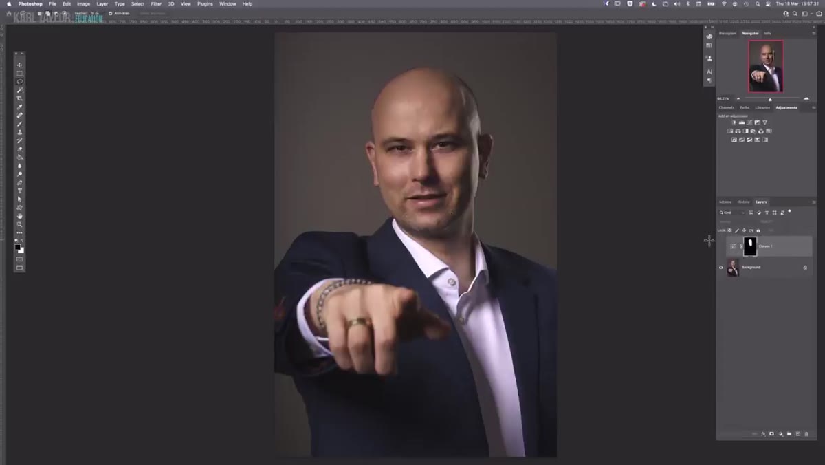 Viewer attention drawn to hand instead of face in portrait shot
Carl makes a point that photographers often cannot see their own images clearly because they are too close to the decision-making process. You know what you intended, so you see your intention instead of what is actually there. One critique example shows a portrait where the subject’s hand becomes the focal point of the image because of how it is lit and positioned. The face, the actual subject, barely registers.
Viewer attention drawn to hand instead of face in portrait shot
Carl makes a point that photographers often cannot see their own images clearly because they are too close to the decision-making process. You know what you intended, so you see your intention instead of what is actually there. One critique example shows a portrait where the subject’s hand becomes the focal point of the image because of how it is lit and positioned. The face, the actual subject, barely registers.
The practical tool here is a fresh-eye test. When you open an image for review, look away first, then snap your eyes back to the screen and note the very first place your eye lands. If it is not the face, something in the frame is outcompeting it. Then ask whether that element is intentional. A hand can be part of the story, but it should not be the headline. If it is drawing more attention than the face, adjust your lighting setup on the next shoot or use post-processing to reduce its visual weight by burning it down and ensuring the face is the brightest, sharpest point in the frame.
Step 5: Review Your Work Like a Client, Not a Photographer
 Carl reviewing member-submitted images during live critique session
The overarching lesson Carl draws from his critique session is that most mistakes are invisible to the person who made them. Not because the photographers lack skill, but because they are evaluating their own work through a technical lens when clients are experiencing it emotionally. A client looks at a portrait and either feels like themselves or they don’t.
Carl reviewing member-submitted images during live critique session
The overarching lesson Carl draws from his critique session is that most mistakes are invisible to the person who made them. Not because the photographers lack skill, but because they are evaluating their own work through a technical lens when clients are experiencing it emotionally. A client looks at a portrait and either feels like themselves or they don’t.
Build a review step into your workflow where you look at the final image at small size, thumbnail scale, before you look at it full size. At thumbnail scale, you can see the dominant visual elements immediately. If the hero isn’t dominant at 100 pixels wide, they will not feel dominant in the final image either. Then review at full size for technical quality. This two-pass approach catches hierarchy problems that pixel-level review misses.
What I Added to My Own Process After Watching This
I run a 47-item checklist for every client session, and I added two items directly after watching this tutorial. The first is a background complexity check before we start shooting, where I step back and photograph just the background to see how it reads on its own. The second is a hero-brightness check in my culling phase, where I pull up a before-and-after Lightroom comparison and ask whether the face is the brightest and sharpest element in every hero zone.
The mistake I was making most often was the shoulder exposure problem from Step 1. I had clients who never came back, and I think now I understand why. I was delivering technically acceptable images where the exposure was balanced but the face was competing with bright clothing or a lit background. Technically fine. Commercially weak.
The single most important idea in this entire tutorial is that a correct exposure for the scene is not the same as a correct exposure for the portrait. Your camera meters the whole frame. Your client only cares about one part of it.
Watch the full tutorial on YouTube to see Carl walk through each of these critique examples with the actual before-and-after edits. Seeing the images side by side makes the difference much more tangible than any description can.
Comments
Leave a Comment