
I used to have a portfolio website that I was genuinely embarrassed to hand out. The images were fine. The layout was a disaster. Photos from three different genres were crammed together, the business name was some forgettable combination of words I’d thought sounded artistic at 24, and the navigation made no sense to anyone who wasn’t me. I was losing clients before they ever contacted me, and I knew it.
That changed when I started paying closer attention to how other working photographers structured their online presence. In this Jessica Kobeissi tutorial on YouTube, she walks through exactly how she built her own photography portfolio using Squarespace, including the platform features she relies on, how she curates and sequences her images, and the branding decisions that make a portfolio feel polished and credible. Watch the full tutorial on YouTube - it’s worth your time. Below, I’ve broken it down into the steps that matter most, with notes from my own studio experience layered in.
Step 1: Choose Squarespace as Your Platform (and Know Why)
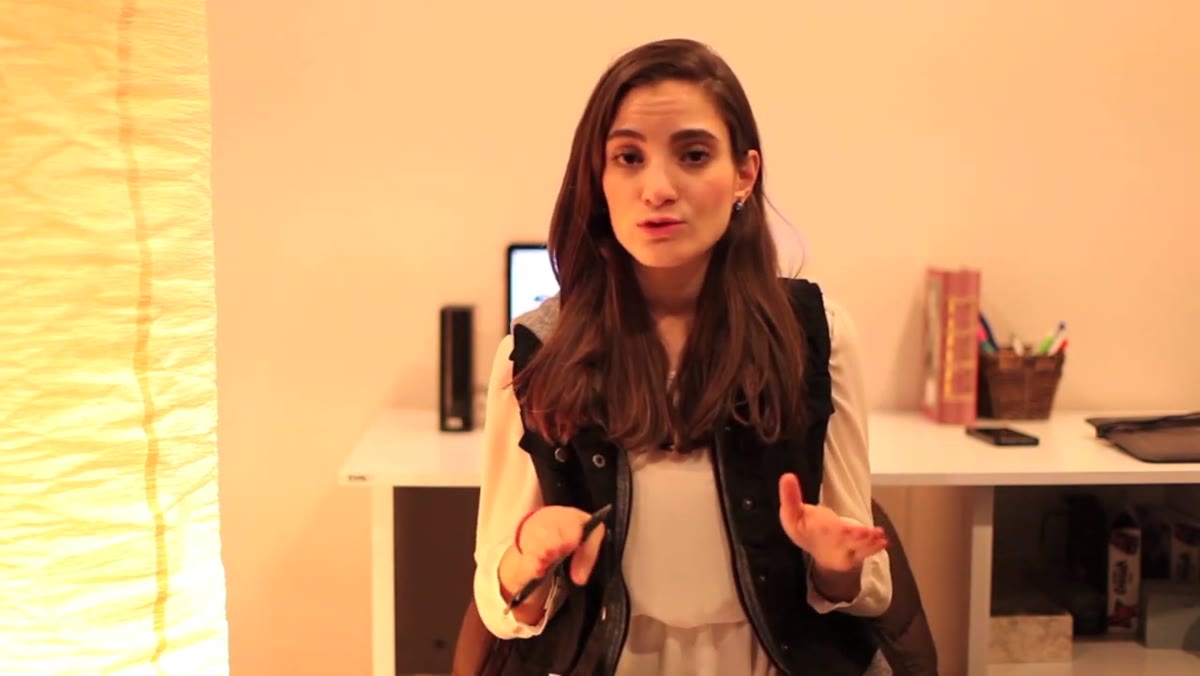 Jessica explaining Squarespace as her top portfolio platform choice
Jessica has used a wide range of website platforms over the years, from WordPress to tools that most people under 30 have never heard of. Her conclusion after testing all of them is that Squarespace is the clearest winner for photographers. The setup is fast. She estimates she had her full portfolio live in roughly an hour and a half. That matters more than people realize, because the longer a platform takes to learn, the more likely you are to put it off indefinitely.
Jessica explaining Squarespace as her top portfolio platform choice
Jessica has used a wide range of website platforms over the years, from WordPress to tools that most people under 30 have never heard of. Her conclusion after testing all of them is that Squarespace is the clearest winner for photographers. The setup is fast. She estimates she had her full portfolio live in roughly an hour and a half. That matters more than people realize, because the longer a platform takes to learn, the more likely you are to put it off indefinitely.
From a business standpoint, Squarespace also looks professional out of the box. You are not fighting against ugly default styling or hunting for the right plugin. For photographers especially, visual presentation is the whole game, and Squarespace’s templates are built with image-forward layouts as the default.
Step 2: Organize Your Pages Around Books, Not Categories
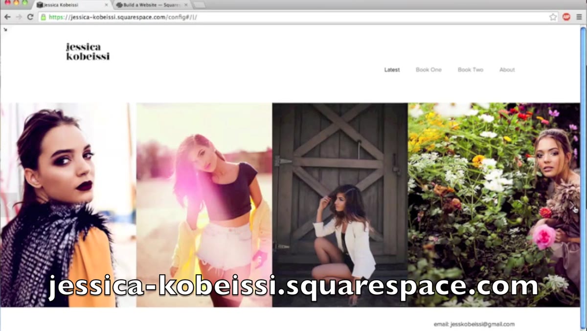 Squarespace panel showing Latest Work, Book One, Book Two navigation
Jessica structures her portfolio using a “Latest Work” section plus two separate books. Book One holds her most recent and strongest work. Book Two serves as a secondary collection. This approach keeps the navigation clean and gives returning visitors a clear sense of where to look for new material.
Squarespace panel showing Latest Work, Book One, Book Two navigation
Jessica structures her portfolio using a “Latest Work” section plus two separate books. Book One holds her most recent and strongest work. Book Two serves as a secondary collection. This approach keeps the navigation clean and gives returning visitors a clear sense of where to look for new material.
The key insight here is restraint. She recommends keeping each section to around ten images. Not twenty, not thirty. Ten. I know how hard that is. I have a 47-item client experience checklist, and editing my own portfolio down felt just as painful. But a hiring client or a potential bride is not sitting down to browse a gallery. They are scanning fast, making a gut call, and moving on. Ten images that are all strong will always outperform forty images where a dozen are filler.
Step 3: Sequence Your Images Strategically
 Jessica describing best image first, second-best image last rule
This is the step most photographers skip, and it costs them. Jessica’s rule is specific: your best image goes first, your second-best image goes last. Everything in the middle should be work you genuinely love, but those two anchor positions are where attention is highest.
Jessica describing best image first, second-best image last rule
This is the step most photographers skip, and it costs them. Jessica’s rule is specific: your best image goes first, your second-best image goes last. Everything in the middle should be work you genuinely love, but those two anchor positions are where attention is highest.
The reasoning is psychological. People judge the quality of a gallery based on what they see first and what they walk away with. If your opener is average and your closer is forgettable, that is the impression that sticks. If you are not sure which of your images qualifies as your best, Jessica’s advice is to ask someone you respect, specifically another photographer whose work you admire. I do the same thing before any major portfolio update. You are too close to your own work to see it clearly.
Step 4: Use the Live Editing Panel to Rearrange Images Instantly
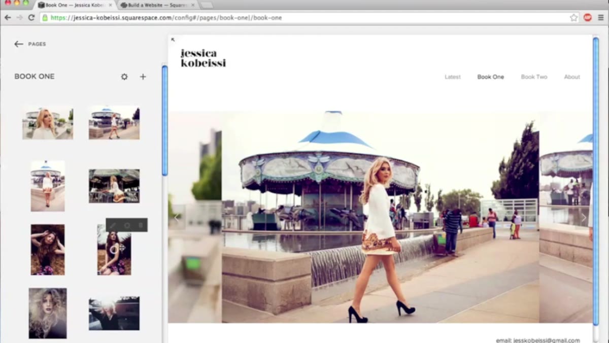 Dragging and dropping images in live Squarespace panel view
One of the features Jessica highlights with genuine enthusiasm is Squarespace’s drag-and-drop image reordering inside the live editing panel. You can pull up your portfolio page while logged in, grab any image, drag it to a new position, and the site updates in real time. No saving, no publishing, no separate preview window.
Dragging and dropping images in live Squarespace panel view
One of the features Jessica highlights with genuine enthusiasm is Squarespace’s drag-and-drop image reordering inside the live editing panel. You can pull up your portfolio page while logged in, grab any image, drag it to a new position, and the site updates in real time. No saving, no publishing, no separate preview window.
This matters operationally. The easier it is to update your portfolio, the more often you will actually do it. Photographers who treat their portfolio as a “set it and forget it” asset lose ground to competitors who are actively refreshing theirs. I update my own portfolio at least once a quarter, and the fact that it takes me fifteen minutes rather than an hour makes it something I actually follow through on.
Step 5: Name Your Business Like a Professional, Not a Brand Concept
 Jessica advising on photography business naming conventions
Jessica is direct on this point, and I agree with her completely. Use your real name as your business name. First and last, exactly as people would search for you. She acknowledges that some photographers go the route of using their first name combined with a middle name, or something that sounds distinctive, and that can work. What does not work is a random combination of nouns you happen to like.
Jessica advising on photography business naming conventions
Jessica is direct on this point, and I agree with her completely. Use your real name as your business name. First and last, exactly as people would search for you. She acknowledges that some photographers go the route of using their first name combined with a middle name, or something that sounds distinctive, and that can work. What does not work is a random combination of nouns you happen to like.
The reason is simple: your business name is a trust signal. When someone refers you to a friend, they say your name. When someone searches for you after meeting you, they type your name. If your business is called something like “Crimson Light Photography,” that connection breaks down. You are adding friction between the person who wants to hire you and the website where they can do it. Your name is already memorable to the people who matter.
Step 6: Keep Your Navigation Minimal and Turn Off What You Are Not Using
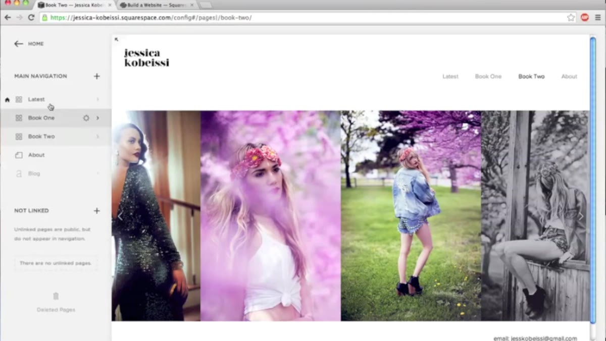 Jessica showing blog toggled off in Squarespace navigation settings
Jessica mentions that she turned her blog off because she is not actively writing content for it yet. Rather than leaving a half-finished or empty blog visible, she simply toggled it off in the navigation until she is ready. This is a small decision with a real impact on how professional your site looks.
Jessica showing blog toggled off in Squarespace navigation settings
Jessica mentions that she turned her blog off because she is not actively writing content for it yet. Rather than leaving a half-finished or empty blog visible, she simply toggled it off in the navigation until she is ready. This is a small decision with a real impact on how professional your site looks.
Every page in your navigation that does not serve the visitor is a distraction. A client looking to book a photographer does not need to click through three empty pages to understand that. Keep your navigation to the pages that are actively doing work: your portfolio, an about page, and a contact page. That is genuinely all you need to start booking clients.
What I’d Add From My Own Experience
The tutorial covers the structural and visual side of building a portfolio well. What it does not get into, understandably for a single video, is what happens after the site is live. A beautiful portfolio with no clear call to action is still a missed opportunity.
When I rebuilt my own site, I added a single line at the bottom of every gallery page: a direct link to my contact form with a short sentence about what I offer. Before that change, visitors were landing on my portfolio, liking what they saw, and then leaving because they did not know what to do next. After adding it, my inquiry rate went up noticeably within the first month. Your portfolio is not just a gallery. It is the first step in a booking funnel, and it should be built that way from the start.
The single most important thing Jessica’s tutorial reinforced for me is that your portfolio communicates your standards before you ever speak to a client. The platform, the image count, the sequencing, the business name, all of it sends a signal about how seriously you take your work. Get those fundamentals right, and the rest of your marketing gets easier.
Watch the full tutorial on YouTube to see Jessica walk through her actual Squarespace panel and demonstrate these features in real time.
Comments (8)
Great breakdown. The step-by-step approach really helps.
The before and after really sells it. Incredible difference.
Finally someone explains this in a way that actually makes sense.
Quality content like this is rare. Keep it up.
Excellent tutorial. I'd add that from a gear standpoint, this technique is incredibly versatile.
The tip about how to build a photography por was the missing piece for me. Thank you.
Applied this to my portfolio shots and the improvement is noticeable.
My workflow just got 10x faster. Not even kidding.
Leave a Comment