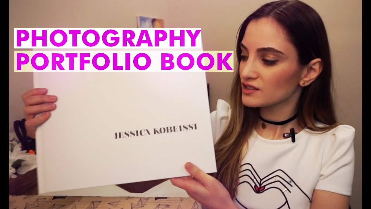
Every photographer I know obsesses over their website and ignores the thing that sometimes closes the deal faster than any Instagram grid: a physical portfolio book. I learned this the hard way when I walked into a meeting with a potential commercial client, laptop open, squinting at my screen together with a stranger across a conference table. It was awkward, slow, and forgettable. A printed book sitting on that table would have done something a screen never can. It would have made the work feel real and valuable before I said a single word.
In this Jessica Kobeissi tutorial, she walks through the entire process of creating her printed portfolio book, from choosing a printer to designing each spread to deciding which images make the cut. Watch the full tutorial on YouTube. What I appreciate about her approach is that it is not precious or overly complicated. She is a working photographer solving a real deadline problem, which is the best kind of teacher to learn from.
If you photograph people and you have any interest in agency work, editorial clients, or even high-end portrait clients, this walkthrough is worth your full attention. Here is how she builds the book, step by step.
Step 1: Choose Your Printer and File Format
 Blurb.com mentioned as the portfolio printing service
Jessica prints her book through Blurb.com, and she specifically chooses the option to upload her own custom file rather than using their pre-built templates. This matters. Templates limit your typography, your margins, and your overall feel. If you already know Adobe InDesign, design the book yourself and export a PDF to Blurb’s specs. If InDesign is new to you, their template route is fine to start, but plan to outgrow it. Blurb’s print quality for photography is solid, and the upload workflow is straightforward once your file is properly sized.
Blurb.com mentioned as the portfolio printing service
Jessica prints her book through Blurb.com, and she specifically chooses the option to upload her own custom file rather than using their pre-built templates. This matters. Templates limit your typography, your margins, and your overall feel. If you already know Adobe InDesign, design the book yourself and export a PDF to Blurb’s specs. If InDesign is new to you, their template route is fine to start, but plan to outgrow it. Blurb’s print quality for photography is solid, and the upload workflow is straightforward once your file is properly sized.
Step 2: Design Every Page in InDesign
 InDesign mentioned as the layout tool used for every page
Jessica designs every single spread in InDesign rather than leaving layout decisions to a template engine. This gives her control over image placement, white space, and the pacing of the book as a visual experience. Treat your InDesign document dimensions as sacred from the start. Set your document to Blurb’s exact size before you place a single image, because resizing later distorts spacing and forces you to redo your work. Use guides and consistent margins across pages so the book feels considered and intentional rather than assembled page by page.
InDesign mentioned as the layout tool used for every page
Jessica designs every single spread in InDesign rather than leaving layout decisions to a template engine. This gives her control over image placement, white space, and the pacing of the book as a visual experience. Treat your InDesign document dimensions as sacred from the start. Set your document to Blurb’s exact size before you place a single image, because resizing later distorts spacing and forces you to redo your work. Use guides and consistent margins across pages so the book feels considered and intentional rather than assembled page by page.
Step 3: Choose a Large Format Size
 Physical book shown, described as 13 by 11 inches
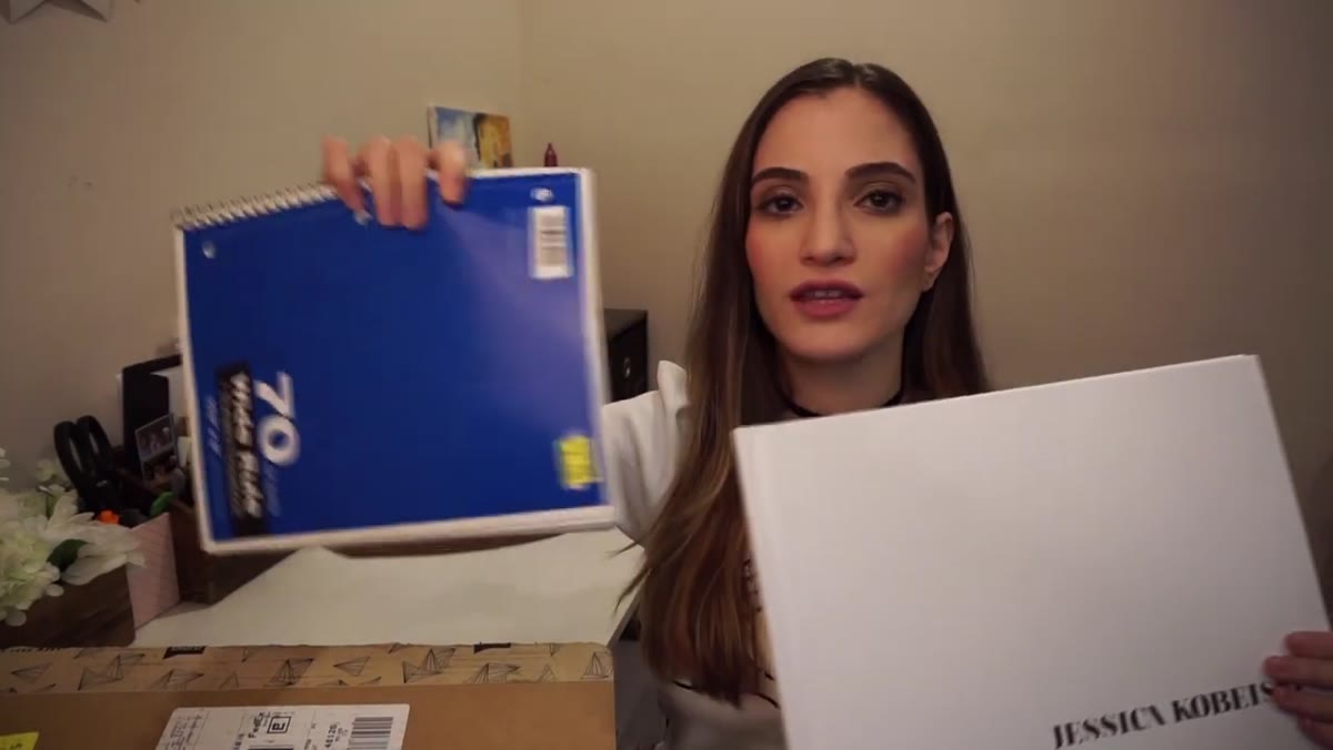
She prints at 13 by 11 inches and shows how dramatically different that feels compared to a smaller size. When you are presenting to an agency or a commercial client, size signals confidence. A small book reads like a side project. A large-format book reads like someone who takes their craft seriously. The larger size also lets your images breathe. Portrait photography especially suffers when it is cramped into a small space. If cost is a concern, print one large book for client meetings and a smaller one to leave behind.
Physical book shown, described as 13 by 11 inches
She prints at 13 by 11 inches and shows how dramatically different that feels compared to a smaller size. When you are presenting to an agency or a commercial client, size signals confidence. A small book reads like a side project. A large-format book reads like someone who takes their craft seriously. The larger size also lets your images breathe. Portrait photography especially suffers when it is cramped into a small space. If cost is a concern, print one large book for client meetings and a smaller one to leave behind.
Step 4: Curate the Opening Image Ruthlessly
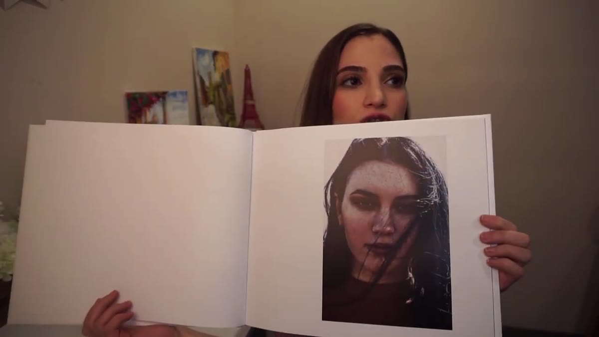 First interior page shown with a single strong portrait
The first image inside the cover is doing heavy lifting. Jessica places a single strong portrait on that opening page, nothing else. No text, no collage, no clever graphic. Just one image that earns your viewer’s attention before they turn another page. When I built my own portfolio book, I made the mistake of opening with a two-image spread because I could not choose between them. A colleague flipped through it and said it felt like I was hedging. She was right. Pick one image for page one, make it your best, and let the viewer sit with it.
First interior page shown with a single strong portrait
The first image inside the cover is doing heavy lifting. Jessica places a single strong portrait on that opening page, nothing else. No text, no collage, no clever graphic. Just one image that earns your viewer’s attention before they turn another page. When I built my own portfolio book, I made the mistake of opening with a two-image spread because I could not choose between them. A colleague flipped through it and said it felt like I was hedging. She was right. Pick one image for page one, make it your best, and let the viewer sit with it.
Step 5: Plan Image Pairs and Spreads Intentionally
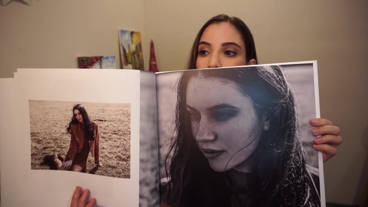 Multi-image spread shown with close-up and wider shot of same subject
As she moves through the book, Jessica pairs a close-up portrait with a wider shot of the same subject on facing pages. This is smart sequencing. It shows range within a consistent vision rather than jumping between wildly different aesthetics. Think of your book in terms of chapters: one subject or one shoot can anchor a two-page spread, giving the viewer a complete idea before moving on. Variety in crop and framing within a spread reads as skill. Variety in subject, mood, and style from spread to spread can read as inconsistency, so group similar work together.
Multi-image spread shown with close-up and wider shot of same subject
As she moves through the book, Jessica pairs a close-up portrait with a wider shot of the same subject on facing pages. This is smart sequencing. It shows range within a consistent vision rather than jumping between wildly different aesthetics. Think of your book in terms of chapters: one subject or one shoot can anchor a two-page spread, giving the viewer a complete idea before moving on. Variety in crop and framing within a spread reads as skill. Variety in subject, mood, and style from spread to spread can read as inconsistency, so group similar work together.
Step 6: Build in Buffer Time for Revisions
 Multiple exported PDF versions mentioned, revisions took months
Jessica exports around 15 versions of her PDF before landing on the final file. This is not a failure of efficiency. It is what happens when you take the work seriously. Build at least three to four weeks of revision time into your timeline before you need the book in hand. Color shift between screen and print is real. What looks rich and warm on a calibrated monitor can print cooler or flatter depending on paper stock and your color profile. Order a proof copy before your full run, check it in natural light, and adjust your export settings accordingly.
Multiple exported PDF versions mentioned, revisions took months
Jessica exports around 15 versions of her PDF before landing on the final file. This is not a failure of efficiency. It is what happens when you take the work seriously. Build at least three to four weeks of revision time into your timeline before you need the book in hand. Color shift between screen and print is real. What looks rich and warm on a calibrated monitor can print cooler or flatter depending on paper stock and your color profile. Order a proof copy before your full run, check it in natural light, and adjust your export settings accordingly.
What I Would Add: Send the Book Before the Meeting
Jessica mentions she needed her book ready for an agency appointment in Chicago, which tells you exactly what this tool is for. It is a meeting tool. But here is something I have started doing in my studio that takes it further: I send a smaller version of the printed book to prospective high-end portrait clients before our consultation call. Not a PDF. An actual book, mailed to their home.
My client experience checklist includes this as a step for any prospect above a certain budget threshold. The response rate on those consultations is significantly higher than it was before I started doing this, and three clients have mentioned the book specifically as the reason they decided to book. A screen is something you scroll past. A physical object on someone’s kitchen counter is something they keep coming back to. The unit economics work out because the clients it attracts are worth the cost of the book and the shipping many times over.
The single most important idea in this entire tutorial is that a printed book forces you to make editorial decisions about your own work. You cannot include everything. You have to choose, sequence, and commit. That process alone will sharpen how you see your portfolio, and it will show in every other place your work lives, including your website.
Watch the full tutorial on YouTube to see Jessica flip through every page of her finished book and hear her explain the thinking behind each spread. If you are considering agency work or any client relationship where first impressions are worth real money, this is time well spent.
Comments (2)
Clear and practical. No fluff. Appreciate that.
Finally someone explains this in a way that actually makes sense.
Leave a Comment