
Every quarter, I pull up my studio website the way a potential client would: fresh browser, no cache, no familiarity. I set a timer for thirty seconds and just scroll. It’s uncomfortable. More than once I’ve caught something that made me cringe, a gallery that hadn’t been updated in eight months, a contact button that was too buried to find quickly. That habit has probably saved me more clients than any ad I’ve ever run.
So when I came across this Visual Education tutorial on whether your online photography portfolio is actually working for you, Watch the full tutorial on YouTube, I watched the whole thing in one sitting. The host does something genuinely useful: he evaluates real photographers’ live websites cold, with no preparation, just honest first impressions. It mirrors exactly what your potential clients are doing when they land on your site. What he finds is instructive, and a little humbling.
The core argument is simple but worth saying out loud. A Facebook page and an Instagram account are not a business. They’re a starting point. Clients, whether they’re art directors booking a food photographer or families looking for a portrait photographer, want to go deeper before they hand over money. Your website is where that decision gets made. Here is how to think through yours, step by step, using the framework from this tutorial.
Step 1: Do a Cold First-Impression Audit
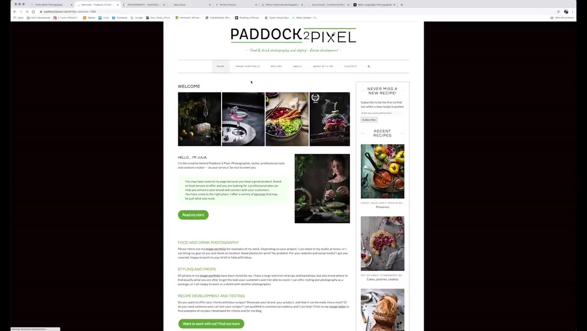
 First photography website loaded for cold review
Open your own website in a private or incognito browser window. Scroll through it quickly, about 30 seconds, without clicking anything. Ask yourself one question: is it immediately obvious what kind of photographer you are and who you serve? In the tutorial, the host lands on a food photographer’s site and within seconds knows exactly what she does. That clarity is the goal. If someone has to read your “About” page to figure out your specialty, you’ve already lost them.
First photography website loaded for cold review
Open your own website in a private or incognito browser window. Scroll through it quickly, about 30 seconds, without clicking anything. Ask yourself one question: is it immediately obvious what kind of photographer you are and who you serve? In the tutorial, the host lands on a food photographer’s site and within seconds knows exactly what she does. That clarity is the goal. If someone has to read your “About” page to figure out your specialty, you’ve already lost them.
Step 2: Check That Your Visual Identity Matches Your Market
 Discussion of tone differences between portrait and commercial sites
A wedding and portrait photographer’s website should feel warm and approachable. A commercial product photographer’s site can afford to feel sleek and minimal. A food photographer might lean intimate and tactile. These aren’t arbitrary aesthetic choices, they’re signals that tell your target client “this person understands my world.” The tutorial makes this point clearly: the tone of your site communicates who you are before a single word is read. Look at your color palette, your font choices, your hero image. Do they speak to the client you want, or the client you used to take?
Discussion of tone differences between portrait and commercial sites
A wedding and portrait photographer’s website should feel warm and approachable. A commercial product photographer’s site can afford to feel sleek and minimal. A food photographer might lean intimate and tactile. These aren’t arbitrary aesthetic choices, they’re signals that tell your target client “this person understands my world.” The tutorial makes this point clearly: the tone of your site communicates who you are before a single word is read. Look at your color palette, your font choices, your hero image. Do they speak to the client you want, or the client you used to take?
Step 3: Evaluate Your Call to Action Placement
 Book a call button visible at top of photographer’s homepage
One of the sites reviewed in the tutorial has a “Book a Call” button right at the top of the page. The host flags this as a smart move. Too many photographers bury their contact options at the bottom of a long scroll, or worse, on a separate page that requires two clicks to reach. Your call to action, whether that’s booking a consultation, requesting a quote, or simply getting in touch, should be visible without any scrolling. Put it in your navigation and again somewhere in the top section of your homepage. Don’t make interested clients work to find you.
Book a call button visible at top of photographer’s homepage
One of the sites reviewed in the tutorial has a “Book a Call” button right at the top of the page. The host flags this as a smart move. Too many photographers bury their contact options at the bottom of a long scroll, or worse, on a separate page that requires two clicks to reach. Your call to action, whether that’s booking a consultation, requesting a quote, or simply getting in touch, should be visible without any scrolling. Put it in your navigation and again somewhere in the top section of your homepage. Don’t make interested clients work to find you.
Step 4: Audit the Depth of Your Portfolio Content
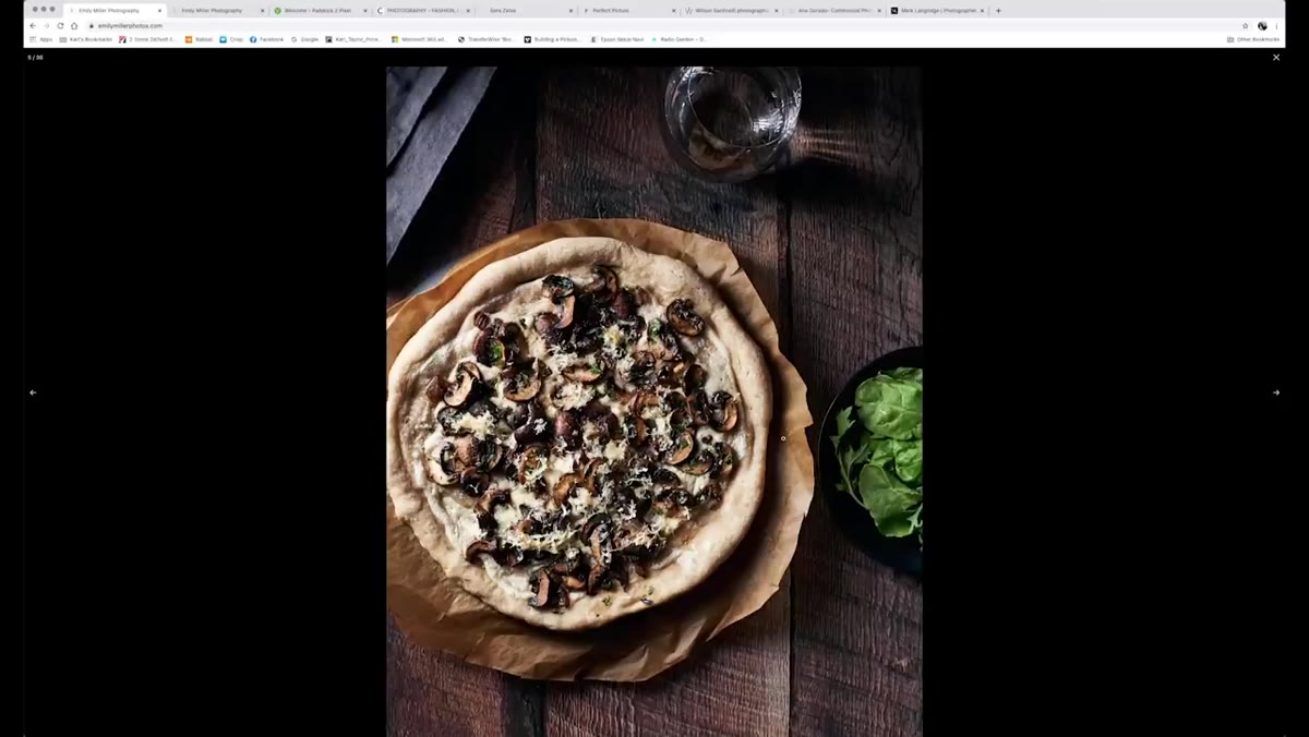 Homepage with limited single gallery and no additional image depth
This is where a lot of otherwise solid websites fall short. The tutorial highlights a food photography site that looks clean and professional but only shows images from a single flat gallery. There’s no way to click through for more. For a client who is seriously considering hiring you, that’s not enough. They want to see range, consistency, and volume. Build out your portfolio into multiple galleries if your work spans different styles or subjects. Even within one specialty, give visitors enough images to feel confident in your consistency. A thin portfolio raises doubt; a rich one builds trust.
Homepage with limited single gallery and no additional image depth
This is where a lot of otherwise solid websites fall short. The tutorial highlights a food photography site that looks clean and professional but only shows images from a single flat gallery. There’s no way to click through for more. For a client who is seriously considering hiring you, that’s not enough. They want to see range, consistency, and volume. Build out your portfolio into multiple galleries if your work spans different styles or subjects. Even within one specialty, give visitors enough images to feel confident in your consistency. A thin portfolio raises doubt; a rich one builds trust.
Step 5: Be Intentional About Your Portfolio Categories
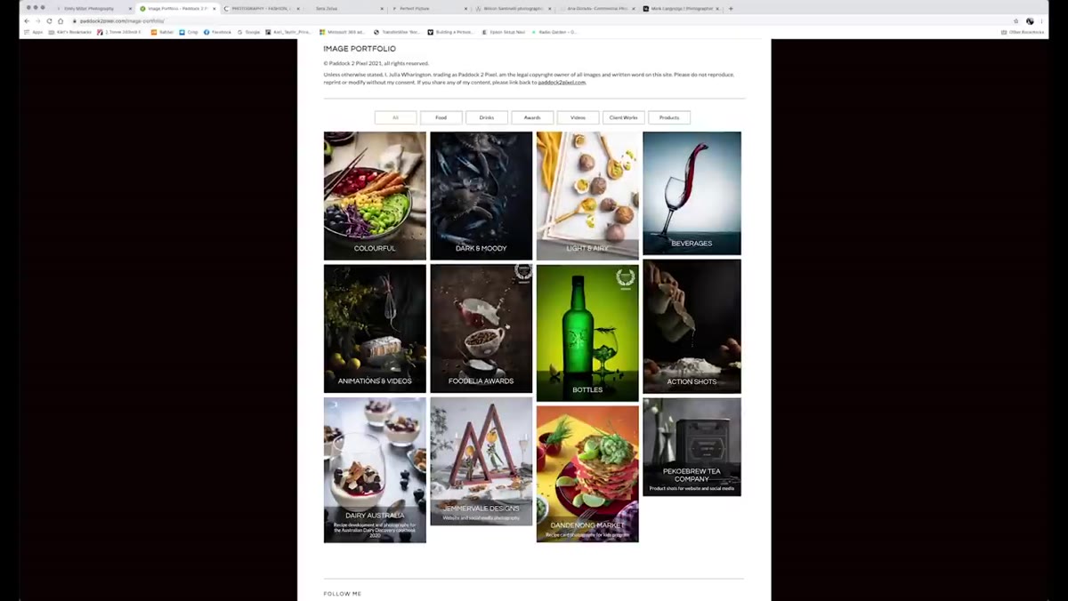 Portfolio broken into style categories: colorful, dark, moody, light and airy
One of the more sophisticated moves shown in the tutorial is a photographer who has broken their portfolio into style categories rather than just subject categories. Think “dark and moody” versus “light and airy” rather than just “food” or “portraits.” This is smart for one specific reason: the people hiring commercial photographers often include art directors and creative professionals who are briefing a visual style, not just a subject matter. Organizing by mood or aesthetic shows that you understand how visual communication works. Even if you’re a portrait photographer, consider whether organizing by style (outdoor natural light, studio, documentary) would help clients self-select.
Portfolio broken into style categories: colorful, dark, moody, light and airy
One of the more sophisticated moves shown in the tutorial is a photographer who has broken their portfolio into style categories rather than just subject categories. Think “dark and moody” versus “light and airy” rather than just “food” or “portraits.” This is smart for one specific reason: the people hiring commercial photographers often include art directors and creative professionals who are briefing a visual style, not just a subject matter. Organizing by mood or aesthetic shows that you understand how visual communication works. Even if you’re a portrait photographer, consider whether organizing by style (outdoor natural light, studio, documentary) would help clients self-select.
Step 6: Assess Whether Your Site Explains Your Process or Just Shows Results
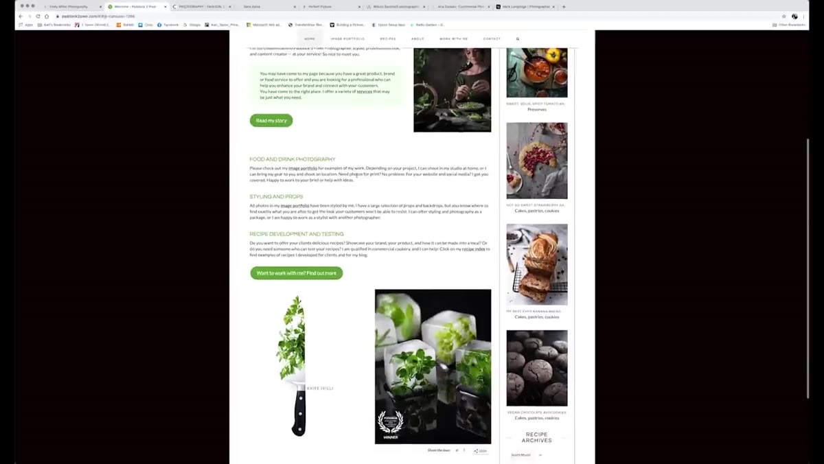 Website homepage leading with technique and process over photography results
The tutorial reviews one site that spends its homepage real estate talking about the photographer’s process, styling approach, and recipe development before showing the actual photography. The host finds this unusual. For most clients, results come first. They need to see your work before they care how you achieve it. Process and methodology belong on an “About” or “Services” page, not as the lead. Get the imagery in front of people immediately, then let your process content do the supporting work deeper in the site.
Website homepage leading with technique and process over photography results
The tutorial reviews one site that spends its homepage real estate talking about the photographer’s process, styling approach, and recipe development before showing the actual photography. The host finds this unusual. For most clients, results come first. They need to see your work before they care how you achieve it. Process and methodology belong on an “About” or “Services” page, not as the lead. Get the imagery in front of people immediately, then let your process content do the supporting work deeper in the site.
Step 7: Review Your Site Speed on a Real Connection
 Portfolio page taking noticeable time to load during review
The tutorial notes one portfolio page loading slowly despite the reviewer being on a fast fiber connection. Slow-loading websites lose clients quietly. Nobody tells you they left because your images took five seconds to appear. Run your site through Google PageSpeed Insights or a similar tool. Compress your images before uploading, use a modern image format like WebP where your platform supports it, and avoid loading enormous hero images that aren’t optimized for web. A beautiful site that loads slowly is invisible to anyone who doesn’t wait for it.
Portfolio page taking noticeable time to load during review
The tutorial notes one portfolio page loading slowly despite the reviewer being on a fast fiber connection. Slow-loading websites lose clients quietly. Nobody tells you they left because your images took five seconds to appear. Run your site through Google PageSpeed Insights or a similar tool. Compress your images before uploading, use a modern image format like WebP where your platform supports it, and avoid loading enormous hero images that aren’t optimized for web. A beautiful site that loads slowly is invisible to anyone who doesn’t wait for it.
What I’d Add From My Own Experience
The tutorial focuses heavily on visual presentation, which is exactly right. But there’s one layer I’d stack on top: your website needs to answer the client’s unspoken question, “Can I trust this person with my money?” That trust comes from more than pretty images. It comes from small things: a professional email address that matches your domain, a bio that sounds like a real human wrote it, and testimonials placed near your contact section where they can do the most work.
I track which pages my leads visit before they contact me. Consistently, the ones who convert have visited my testimonials page and my pricing overview page, not just the portfolio. That data shifted how I structured my site. Your portfolio earns the click; your trust signals close the inquiry.
The single most important takeaway from this tutorial is the cold audit. Do it today, in an incognito window, and give yourself thirty seconds. If your specialty isn’t clear, your call to action isn’t visible, and your portfolio feels thin, those are the things to fix before you spend another dollar on advertising. Your website is working for you or against you right now, and most photographers don’t know which.
Watch the full tutorial on YouTube to see the live website reviews in action. Watching someone else’s site get evaluated is one of the fastest ways to see your own with fresh eyes.
Comments (2)
I've watched a dozen tutorials on this and yours is the clearest by far.
Tried this technique this morning. Game changer for real.
Leave a Comment