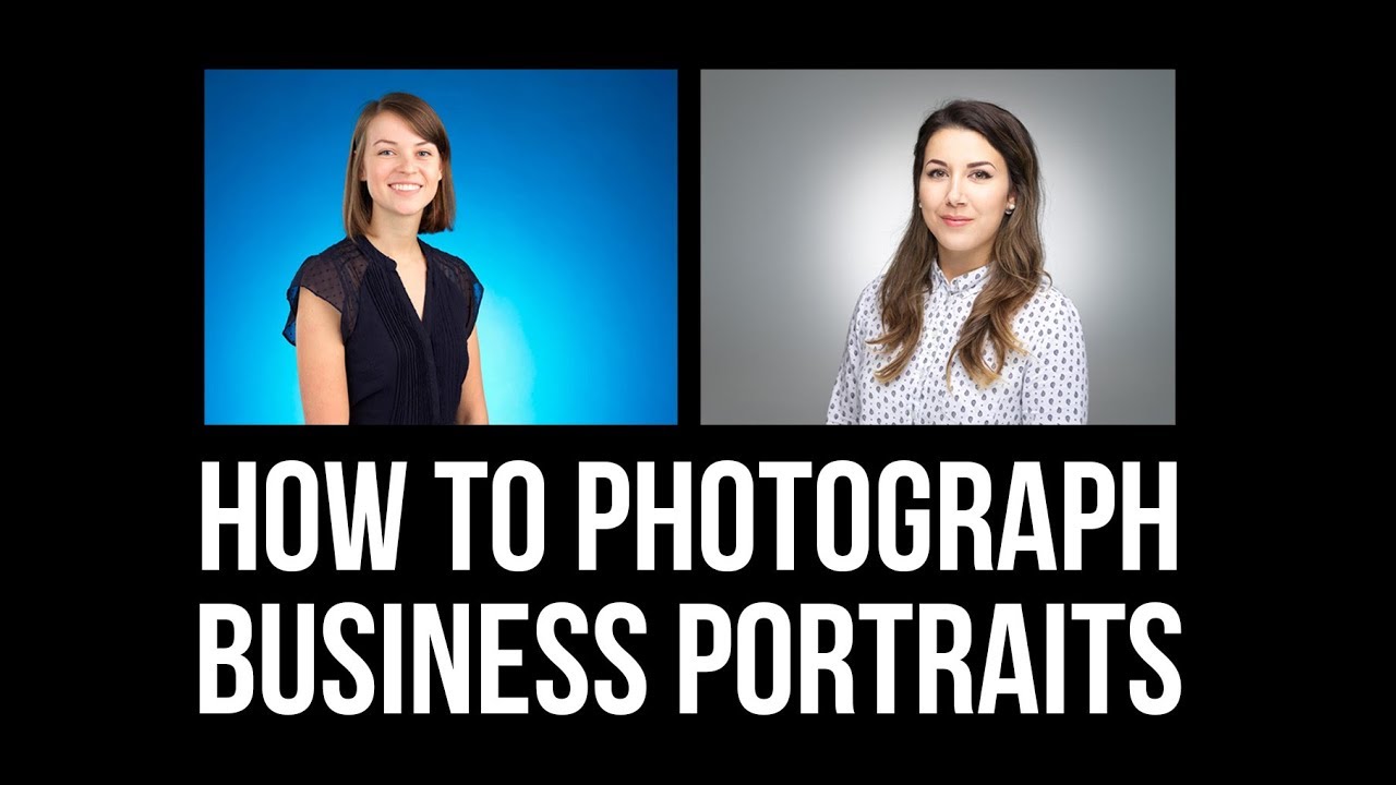
Business portrait clients are not the most forgiving. They show up with a specific idea of how they want to look, a tight schedule, and zero patience for you figuring things out on the fly. Early in my studio career, I was winging my lighting more than I’d like to admit. I had one setup I felt comfortable with, and I bent every client into it whether it suited them or not. Unsurprisingly, my repeat booking rate was embarrassing.
What changed things for me was getting serious about having at least two distinct setups ready before a client walks in the door. One for the polished, editorial-leaning portrait. One for the clean, corporate headshot. In this Visual Education tutorial, photographer Carl Taylor walks through exactly that, and the breakdown is specific enough that you can build both setups before your next session. Watch the full tutorial on YouTube to see the lighting in action alongside the written walkthrough below.
The two setups he covers pull from different ends of the business portrait spectrum, and understanding why they work is just as useful as copying the gear list.
Step 1: Understand the Goal Before You Place a Single Light
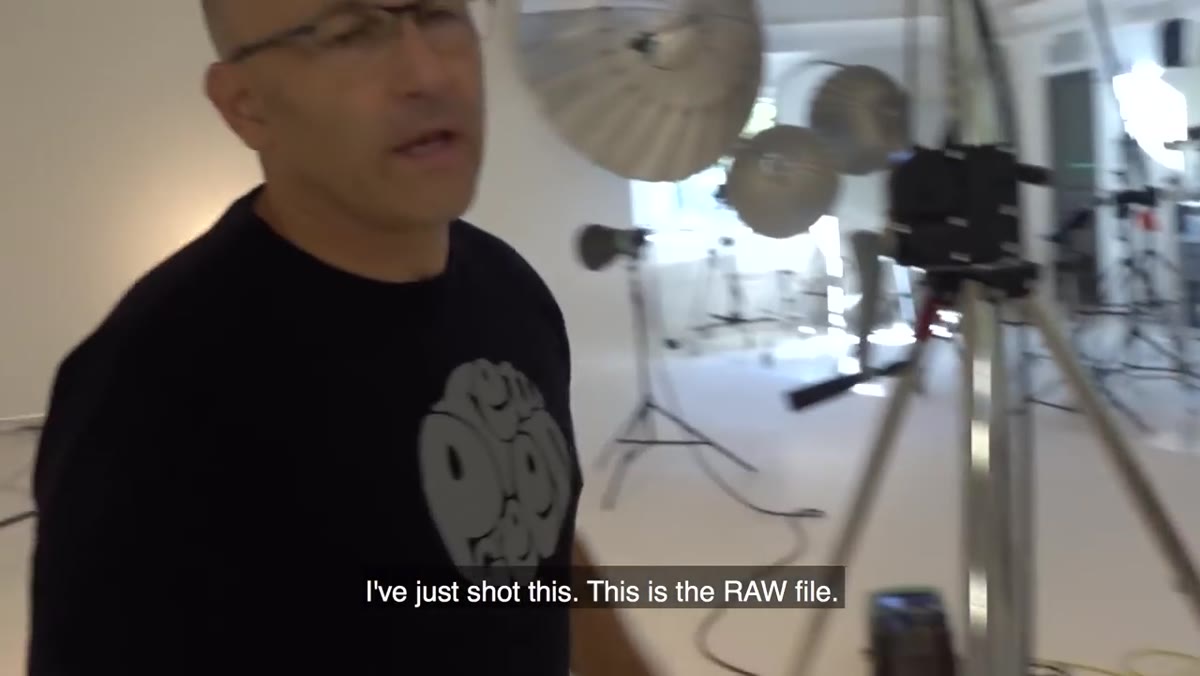 Raw business portrait file displayed on screen
Before touching any equipment, know what kind of portrait you’re making. Carl opens by showing a raw file from his first setup and immediately names it as unconventional. It leans toward beauty and editorial. Knowing that framing tells you everything about the lighting choices that follow. For business portraits, you generally land in one of two briefs: the client wants to look powerful and interesting, or they want to look approachable and professional. Your lighting logic starts there, not with which modifier you reach for first.
Raw business portrait file displayed on screen
Before touching any equipment, know what kind of portrait you’re making. Carl opens by showing a raw file from his first setup and immediately names it as unconventional. It leans toward beauty and editorial. Knowing that framing tells you everything about the lighting choices that follow. For business portraits, you generally land in one of two briefs: the client wants to look powerful and interesting, or they want to look approachable and professional. Your lighting logic starts there, not with which modifier you reach for first.
Ask your client one direct question before the session: “Where will this image be used?” A LinkedIn headshot, a speaking page, and a magazine feature all have different expectations. That single answer narrows your setup before you touch a light stand.
Step 2: Build the Editorial Setup With a Beauty Dish and Globe Light
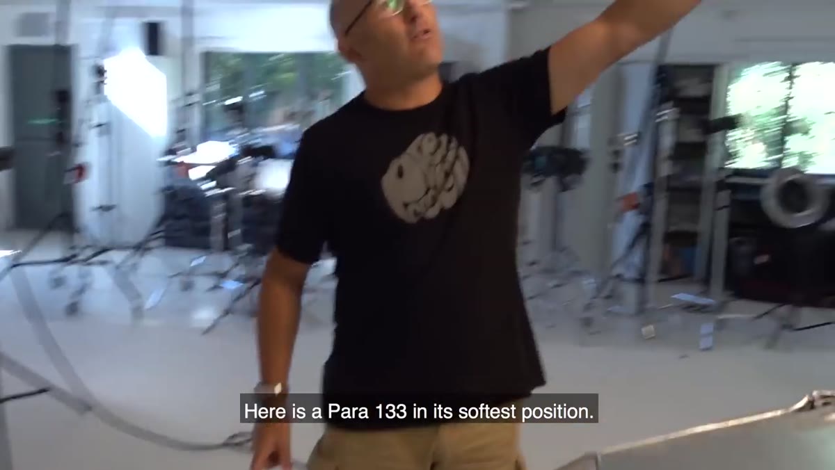 Power 1-3-3 beauty dish positioned beside subject
For the more editorial business portrait, Carl uses a Powa 133 beauty dish as his key light, positioned roughly a meter to a meter and a half from the subject. The beauty dish is used in its single-panel configuration rather than with the side extensions, which keeps the light slightly more directional and creates the contouring effect that makes cheekbones and jawlines read clearly in print. The falloff is intentional. You want the sides of the face to go darker so there is actual dimension rather than a flat, evenly lit surface.
Power 1-3-3 beauty dish positioned beside subject
For the more editorial business portrait, Carl uses a Powa 133 beauty dish as his key light, positioned roughly a meter to a meter and a half from the subject. The beauty dish is used in its single-panel configuration rather than with the side extensions, which keeps the light slightly more directional and creates the contouring effect that makes cheekbones and jawlines read clearly in print. The falloff is intentional. You want the sides of the face to go darker so there is actual dimension rather than a flat, evenly lit surface.
Behind the subject, he places a globe light that functions like a lighthouse lens, throwing a focused beam onto the background. This creates a contained pool of light on the backdrop rather than a general wash. The visual result is a subject that stands apart from the background rather than blending into it, which reads as more dynamic in editorial contexts.
Step 3: Use Fill Lights to Control Your Shadow Depth
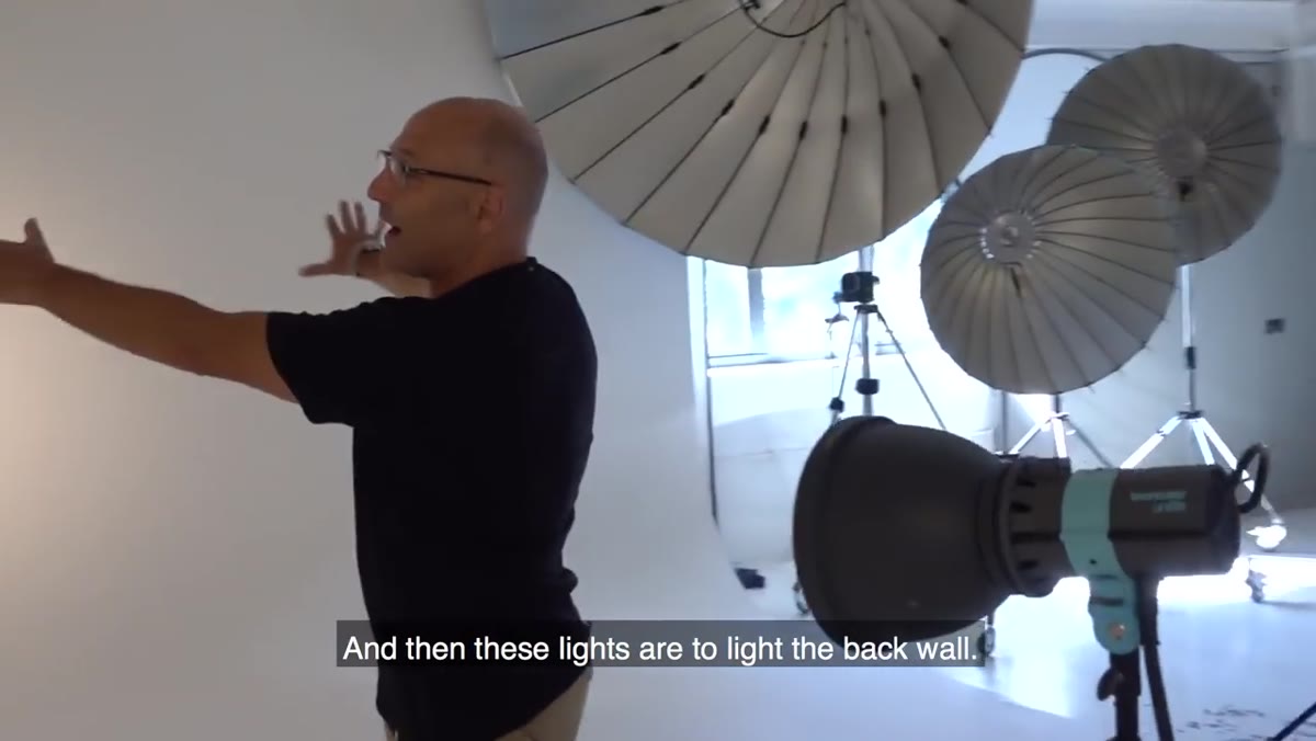 Fill lights positioned to prevent dark grey backdrop
Two additional lights flank the setup to add fill to the background and prevent the backdrop from dropping into an unflattering dark grey. This is a detail a lot of photographers skip, and it shows. Without that fill, the background can go muddy in a way that reads as accidental rather than moody. The fill lights are not there to illuminate the subject. They are there purely to manage the tonal range of the backdrop.
Fill lights positioned to prevent dark grey backdrop
Two additional lights flank the setup to add fill to the background and prevent the backdrop from dropping into an unflattering dark grey. This is a detail a lot of photographers skip, and it shows. Without that fill, the background can go muddy in a way that reads as accidental rather than moody. The fill lights are not there to illuminate the subject. They are there purely to manage the tonal range of the backdrop.
Keep these lights pointed at the back wall, not your subject. Flagging them off from the subject is smart if you have barn doors available. The goal is a background that sits at a controlled mid-tone or light grey rather than an unintended black hole behind your client’s head.
Step 4: Switch Setups for the Conventional Corporate Portrait
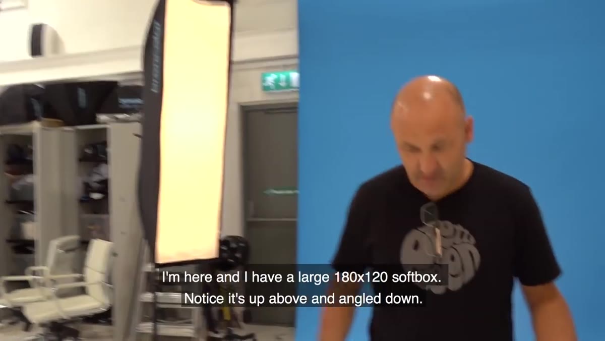 Large 180x120cm softbox angled down toward subject
For the second, more traditional business portrait, Carl moves to a large softbox measuring 180 by 120 centimeters as the key light. The positioning detail here matters more than most photographers realize. The light comes from above at a downward angle. Light from below creates unflattering shadows that travel up the face. Light that comes straight on flattens the face. Light angled down from above works with the natural structure of a face rather than against it.
Large 180x120cm softbox angled down toward subject
For the second, more traditional business portrait, Carl moves to a large softbox measuring 180 by 120 centimeters as the key light. The positioning detail here matters more than most photographers realize. The light comes from above at a downward angle. Light from below creates unflattering shadows that travel up the face. Light that comes straight on flattens the face. Light angled down from above works with the natural structure of a face rather than against it.
A secondary light, roughly one stop dimmer than the key, adds fill from a different angle to create three-dimensionality. Without that fill, a single large softbox can still render a face that looks pasted against the background. The stop difference between the two lights is the ratio that preserves shape without creating harsh shadows.
Step 5: Customize the Background for the Client’s Brand
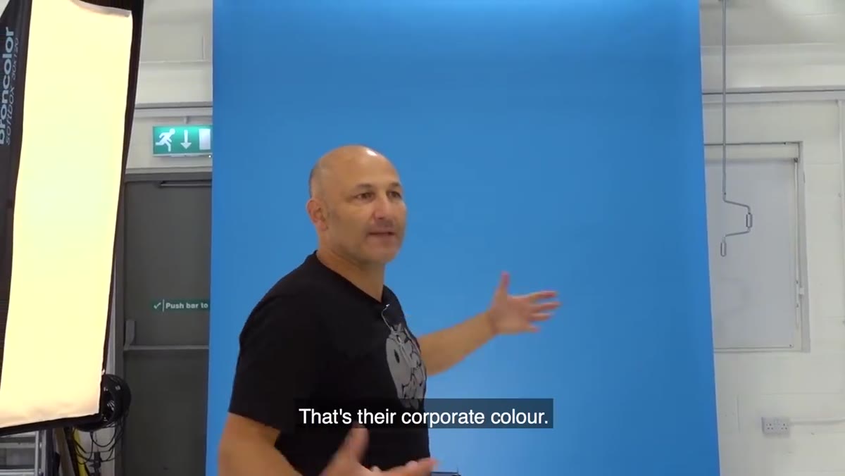 Blue branded backdrop with gradient glow from background light
One of the most practical things Carl shows is using a client’s corporate color as the background. In the example, it’s a blue backdrop that matches the client’s brand palette. A gradient glow light aimed at the backdrop creates depth so it does not look like a flat painted wall. A separate edge light brings out hair detail and adds a rim of light to the side of the face.
Blue branded backdrop with gradient glow from background light
One of the most practical things Carl shows is using a client’s corporate color as the background. In the example, it’s a blue backdrop that matches the client’s brand palette. A gradient glow light aimed at the backdrop creates depth so it does not look like a flat painted wall. A separate edge light brings out hair detail and adds a rim of light to the side of the face.
This is a simple upsell and a genuine service differentiator. When I started offering branded background colors in my studio, my average session fee went up because clients felt the portrait was built for them specifically rather than a generic product. It takes maybe ten minutes to swap a backdrop and calibrate your background light. The perceived value to a client who sees their brand color behind them is significant.
Step 6: Apply Inverse Square Law to Control Background Spill
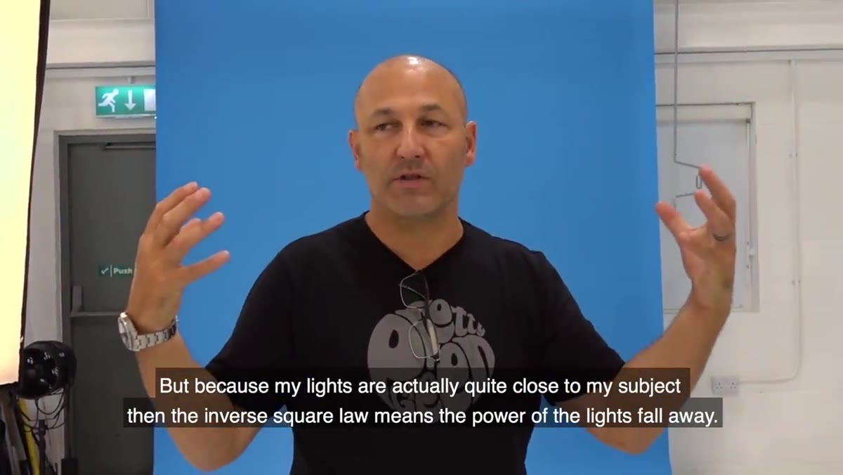 Lights positioned close to subject to reduce background spill
Carl closes the technical portion with a point about physics that solves a common studio problem. When lights are placed too far from the subject, more of their output reaches the background, which reduces your control over background exposure. Placing lights close to the subject causes the light to fall off quickly per the inverse square law, which means less unwanted spill hitting the backdrop and softer, more manageable light on the subject’s face.
Lights positioned close to subject to reduce background spill
Carl closes the technical portion with a point about physics that solves a common studio problem. When lights are placed too far from the subject, more of their output reaches the background, which reduces your control over background exposure. Placing lights close to the subject causes the light to fall off quickly per the inverse square law, which means less unwanted spill hitting the backdrop and softer, more manageable light on the subject’s face.
His studio space runs about four to five meters deep with a nine-foot-wide backdrop roll, and he notes that closer lights would still work in a tighter room. If you are shooting in a smaller space and fighting with a hot background, try moving your key light closer to your subject before reaching for the power dial.
What I’d Add From My Own Studio Practice
Both setups Carl shows assume a purpose-built studio space, and most of us start with something messier. For years I shot in a room that was barely eight feet wide. The principle that saved me was the same one Carl demonstrates without naming it directly: control comes from light placement, not from having more lights. In a tight space, one well-positioned beauty dish or large softbox will outperform four lights placed without intention.
I also learned to build a brief for every business portrait client before they arrive. Knowing their industry, their brand colors, and where the image will live takes maybe five minutes of email exchange but it lets you walk into a session with a specific setup rather than improvising. My booking rate for follow-up corporate work jumped noticeably once I started treating every portrait session like it had a creative brief attached to it.
The single most important thing Carl demonstrates in this tutorial is that business portraits are not one-size-fits-all, and having two distinct setups ready before a client arrives is a professional standard worth building toward. It signals to clients that you know what you’re doing before you fire a single frame.
Watch the full tutorial on YouTube to see both setups demonstrated live with the actual lighting visible.
Comments
Leave a Comment