
I review a lot of photographer websites. It’s basically a professional hazard at this point. I have a client experience checklist I’ve refined over years of running my portrait studio in Miami, and one of the first things on that list is: “Would a stranger trust this website enough to hand over a deposit?” You’d be surprised how many gorgeous portfolios fail that single test. Too much text. No clear contact path. Images that impress other photographers but confuse potential clients.
That’s why I keep coming back to Tony and Chelsea Northrup’s portfolio review series. In Watch the full tutorial on YouTube, they do something most portfolio advice skips entirely: they look at real working photographers’ websites live, out loud, and say exactly what they think. No softening, no vague encouragement. The feedback is specific, honest, and immediately actionable. Episode 7 in particular surfaced patterns I see constantly, and it reinforced several things I wish I had heard earlier in my own business.
The photographer they spend the most time on had already been reviewed twice before and kept iterating based on feedback. That alone tells you something about how growth actually works. You get the note, you apply it, you move forward. The photographers who write angry comments are the ones still using the same homepage they built in 2019.
Step 1: Lead with Full-Screen, Immersive Images
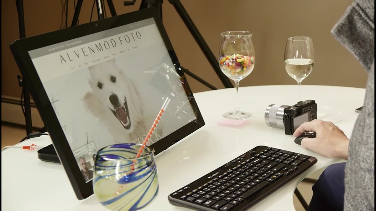 Full-screen portrait photo on photographer’s homepage
Your homepage has one job: stop the scroll and make someone feel something. Tony and Chelsea’s first reaction to this portfolio was immediate and positive because the images filled the screen completely. No cluttered navigation bar competing for attention. No small thumbnails forcing the viewer to squint and evaluate. Just the work, large and confident.
Full-screen portrait photo on photographer’s homepage
Your homepage has one job: stop the scroll and make someone feel something. Tony and Chelsea’s first reaction to this portfolio was immediate and positive because the images filled the screen completely. No cluttered navigation bar competing for attention. No small thumbnails forcing the viewer to squint and evaluate. Just the work, large and confident.
If your portfolio platform lets you set full-bleed or full-screen image display, use it. This isn’t a style preference, it’s a conversion principle. Clients who are scanning quickly need one compelling image to make them slow down. Give it to them.
Step 2: Make Your “About” Section Scannable, Not a Novel
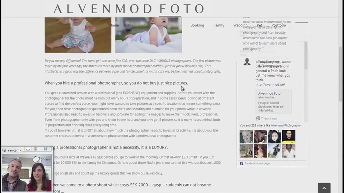 Long text block on photographer’s about or bio page
This is where the review got uncomfortable in the best way. The photographer had written a genuinely thoughtful bio, and Tony and Chelsea acknowledged that. But they also said, clearly, that they couldn’t read all of it. Not because it was bad writing, but because it was too much writing.
Long text block on photographer’s about or bio page
This is where the review got uncomfortable in the best way. The photographer had written a genuinely thoughtful bio, and Tony and Chelsea acknowledged that. But they also said, clearly, that they couldn’t read all of it. Not because it was bad writing, but because it was too much writing.
The rule I use in my own studio: if your about page takes longer than 45 seconds to read, cut it in half. Potential clients are not evaluating your prose. They want to know who you are, what you shoot, and why they should trust you. Three to five sentences and a few bullet points will outperform three paragraphs every time. Save the longer story for your blog or an interview.
Step 3: Audit Your Contact Page for Friction
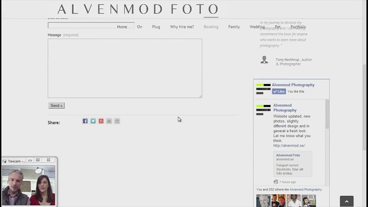 Contact form with phone number and email link options
The review flagged a subtle but important problem: the contact section had a form, but the email icon next to it looked like a share button rather than a direct email link. Tony and Chelsea both said the same thing independently: they wanted to just click and send. That moment of confusion is a moment where a client might give up.
Contact form with phone number and email link options
The review flagged a subtle but important problem: the contact section had a form, but the email icon next to it looked like a share button rather than a direct email link. Tony and Chelsea both said the same thing independently: they wanted to just click and send. That moment of confusion is a moment where a client might give up.
Your contact page should have zero ambiguity. A visible email address that links directly to a mail client, a phone number formatted the way your local clients expect to see it, and a form that is short enough that someone fills it out in under two minutes. If you serve clients in multiple countries, be thoughtful about how you display your phone number. What looks normal to you can look broken to someone in another market.
Step 4: Put Pricing and Portfolio on the Same Page When Possible
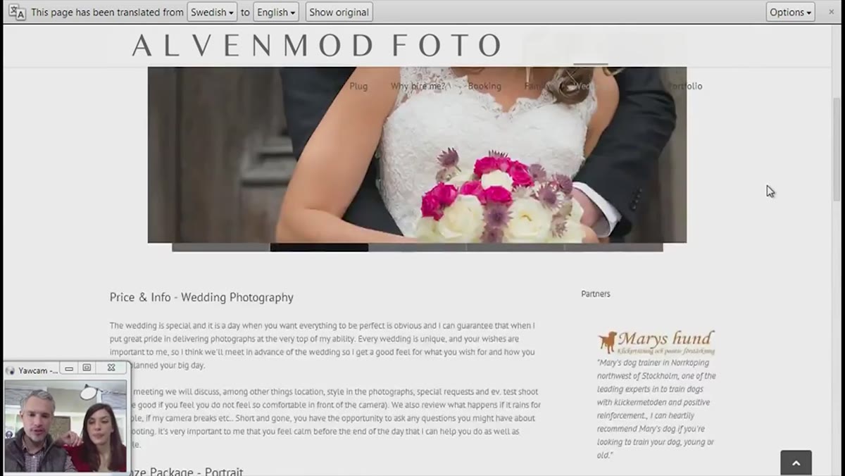 Gallery thumbnails and pricing information displayed together
This one surprised people in the live chat, but it makes complete sense once you think about it from the client’s perspective. When pricing is buried on a separate page, clients have to make an extra decision just to get information they need before they can even decide whether to reach out. That’s friction that costs you inquiries.
Gallery thumbnails and pricing information displayed together
This one surprised people in the live chat, but it makes complete sense once you think about it from the client’s perspective. When pricing is buried on a separate page, clients have to make an extra decision just to get information they need before they can even decide whether to reach out. That’s friction that costs you inquiries.
The photographer being reviewed had organized his wedding packages so that the gallery images and pricing appeared together in one scrollable section. Tony and Chelsea responded positively to this. It respects the client’s time. It signals transparency. And transparency builds the kind of trust that converts browsers into paying clients.
Step 5: Curate Your Gallery Ruthlessly. Five Strong Images Beat Twenty Average Ones
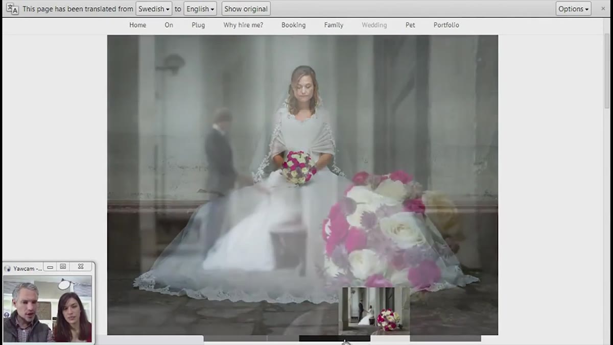 Streamlined gallery showing approximately five selected images
By the end of the review, the photographer had trimmed his featured gallery down to roughly five images. The hosts’ reaction was notably supportive. Five is not too few if every single one of those images is doing real work: showing range, demonstrating skill, or evoking emotion in the ideal client.
Streamlined gallery showing approximately five selected images
By the end of the review, the photographer had trimmed his featured gallery down to roughly five images. The hosts’ reaction was notably supportive. Five is not too few if every single one of those images is doing real work: showing range, demonstrating skill, or evoking emotion in the ideal client.
The temptation to include more is real. I felt it when I first built my studio’s portfolio. You want to show that you’ve shot in different lighting conditions, different venues, different family dynamics. But a tightly edited gallery reads as confidence. A sprawling one reads as insecurity. Pick the images your best client would want to see, and remove everything else.
Step 6: Revisit Your Portfolio After Every Batch of Feedback
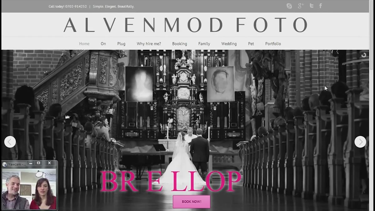 Reviewer noting this is the third review of the same photographer’s portfolio
The meta-lesson running through the entire review is this: the photographers who improve are the ones who come back. The photographer featured had been reviewed twice before and returned a third time with a meaningfully better website each visit. That’s the actual cycle of improvement. Not one big redesign, but incremental refinement based on specific, honest input.
Reviewer noting this is the third review of the same photographer’s portfolio
The meta-lesson running through the entire review is this: the photographers who improve are the ones who come back. The photographer featured had been reviewed twice before and returned a third time with a meaningfully better website each visit. That’s the actual cycle of improvement. Not one big redesign, but incremental refinement based on specific, honest input.
Build a habit of reviewing your own website as if you are a stranger seeing it for the first time. Better yet, ask a non-photographer friend to narrate what they’re thinking as they navigate it. You’ll learn more in ten minutes of watching that than in hours of staring at your own pages.
What I’d Add From My Own Studio Experience
The one thing this review didn’t go deep on is what happens after someone fills out the contact form. I learned the hard way, after losing a significant booking because my follow-up process was inconsistent, that the portfolio gets you the inquiry but your systems close the sale. Response time matters. A confirmation email that arrives instantly makes clients feel seen. A professional quote template signals that you run a real business.
Your website is the front door. Make sure the rest of the house is ready for guests.
The single most important thing to take from this review is that portfolio improvement is not a one-time project. It is a feedback loop. You show your work, you get specific input, you make the change, and you come back. Every photographer in this series who had done that more than once had a noticeably stronger site.
Watch the full tutorial on YouTube and pay attention not just to the specific critiques but to what Tony and Chelsea respond to immediately and warmly. Those instinctive reactions are the clearest signal of what actually works.
Comments (3)
Tried this technique this morning. Game changer for real.
Just used this on a wedding shoot edit. Client was thrilled.
Well explained. I think my audience would really benefit from this — mind if I link to it?
Leave a Comment