Every photographer I know, myself included, has a blind spot when it comes to their own portfolio. We’re too close to the work. We remember the session, the client, the moment we nailed the light, and that memory sneaks into our judgment. A technically average image starts to look great because of what it means to us. That emotional attachment is exactly what costs us bookings.
I’ve been running my portrait studio here in Miami for years, and I still do a full portfolio audit every quarter. Even so, watching Tony and Chelsea Northrup tear through real photographers’ portfolios in their Watch the full tutorial on YouTube series was a gut-check reminder of how many small, fixable mistakes add up to a portfolio that quietly underperforms. This particular session covers a boudoir and portrait photographer’s work, and the feedback applies just as cleanly to anyone shooting lifestyle, couples, or commercial portraits. Here’s what I took away, structured so you can apply it to your own portfolio today.
Step 1: Approach Your Portfolio Like a Potential Client
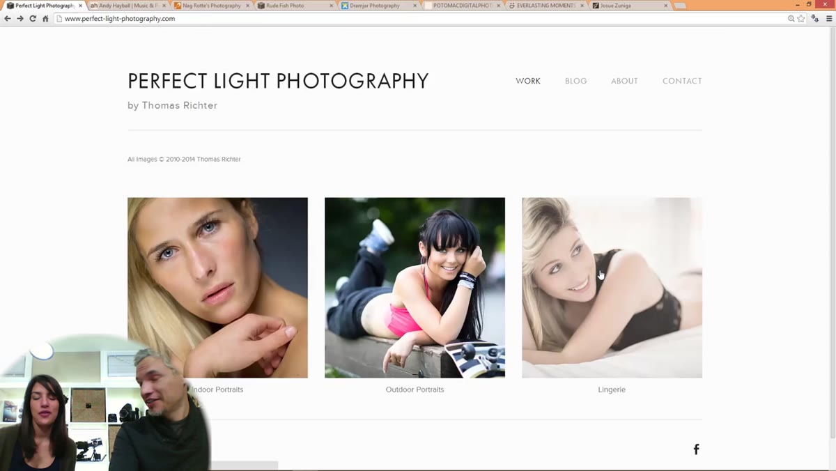
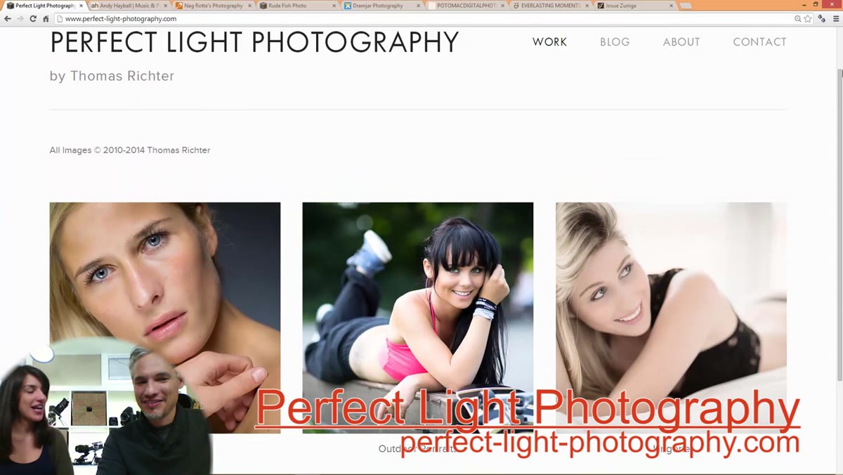 Homepage of Thomas’s photography portfolio loading on screen
Before you touch a single image, sit down and open your own portfolio on a device you don’t normally use, ideally someone else’s laptop or even a phone. You want the fresh-eyes experience a stranger gets. Notice what loads first, what your eye goes to, and whether the site communicates immediately what kind of photographer you are. In this review, Tony and Chelsea note within seconds that the photographer appears to be a professional targeting commercial work across three clear categories. That immediate clarity is the baseline. If a visitor can’t tell what you shoot and who you shoot it for within ten seconds, you have a problem to fix before anything else.
Homepage of Thomas’s photography portfolio loading on screen
Before you touch a single image, sit down and open your own portfolio on a device you don’t normally use, ideally someone else’s laptop or even a phone. You want the fresh-eyes experience a stranger gets. Notice what loads first, what your eye goes to, and whether the site communicates immediately what kind of photographer you are. In this review, Tony and Chelsea note within seconds that the photographer appears to be a professional targeting commercial work across three clear categories. That immediate clarity is the baseline. If a visitor can’t tell what you shoot and who you shoot it for within ten seconds, you have a problem to fix before anything else.
Step 2: Lead with Your Single Strongest Image
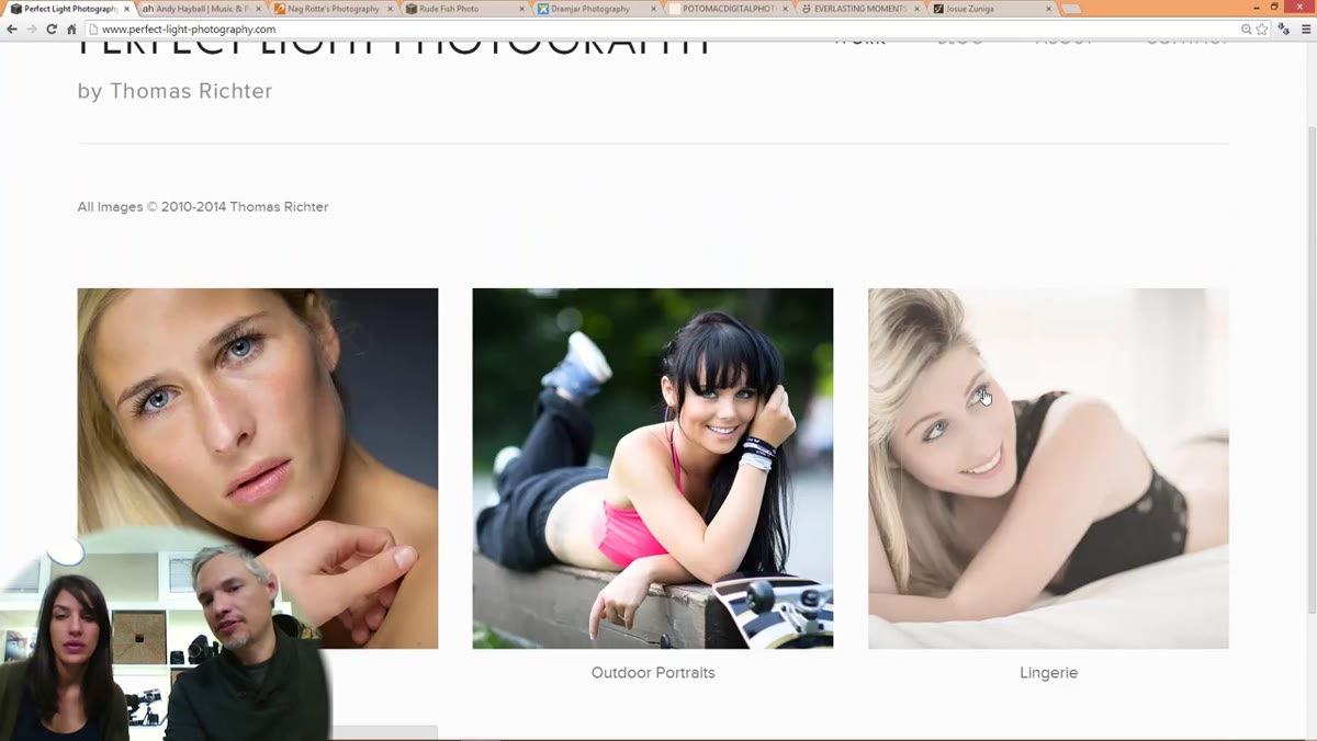 First portrait thumbnail on photographer’s indoor gallery page
The lead image in any gallery is doing the heaviest lifting in your portfolio. Tony and Chelsea flag that the photographer’s lead portrait, while interesting and natural in quality, has a slightly awkward hand pose in the crop and some distracting stray hairs. Those are small things, but they matter enormously on the image that every visitor sees first. Your lead image should be so polished it needs zero excuses. Go into your editing software and zoom to 100% on your current lead image. Look for flyaway hairs, clipped or contorted fingers, unflattering facial expressions, and uneven or harsh light. If you find any of those, that image does not earn the lead spot, no matter how much you love it.
First portrait thumbnail on photographer’s indoor gallery page
The lead image in any gallery is doing the heaviest lifting in your portfolio. Tony and Chelsea flag that the photographer’s lead portrait, while interesting and natural in quality, has a slightly awkward hand pose in the crop and some distracting stray hairs. Those are small things, but they matter enormously on the image that every visitor sees first. Your lead image should be so polished it needs zero excuses. Go into your editing software and zoom to 100% on your current lead image. Look for flyaway hairs, clipped or contorted fingers, unflattering facial expressions, and uneven or harsh light. If you find any of those, that image does not earn the lead spot, no matter how much you love it.
Step 3: Cull Ruthlessly, Even When the Images Are Good
 Multiple portrait thumbnails visible in gallery grid view
This is the one that stings. Tony mentions partway through the review that he’s already feeling fatigued by the volume of images, even though the quality is solid. Chelsea agrees and says the portfolio could be “paired down.” When a viewer feels overwhelmed before they’ve finished your gallery, they leave. The rule I use in my own studio is this: if I have two images that are similar in composition, lighting, and subject, only the stronger one stays. Full stop. Go through each of your galleries and ask, “Would removing this image make the overall gallery weaker?” If the honest answer is no, cut it. Most photographers should be showing 10 to 15 images per category, not 25 to 35.
Multiple portrait thumbnails visible in gallery grid view
This is the one that stings. Tony mentions partway through the review that he’s already feeling fatigued by the volume of images, even though the quality is solid. Chelsea agrees and says the portfolio could be “paired down.” When a viewer feels overwhelmed before they’ve finished your gallery, they leave. The rule I use in my own studio is this: if I have two images that are similar in composition, lighting, and subject, only the stronger one stays. Full stop. Go through each of your galleries and ask, “Would removing this image make the overall gallery weaker?” If the honest answer is no, cut it. Most photographers should be showing 10 to 15 images per category, not 25 to 35.
Step 4: Identify and Promote Your Best Work Objectively
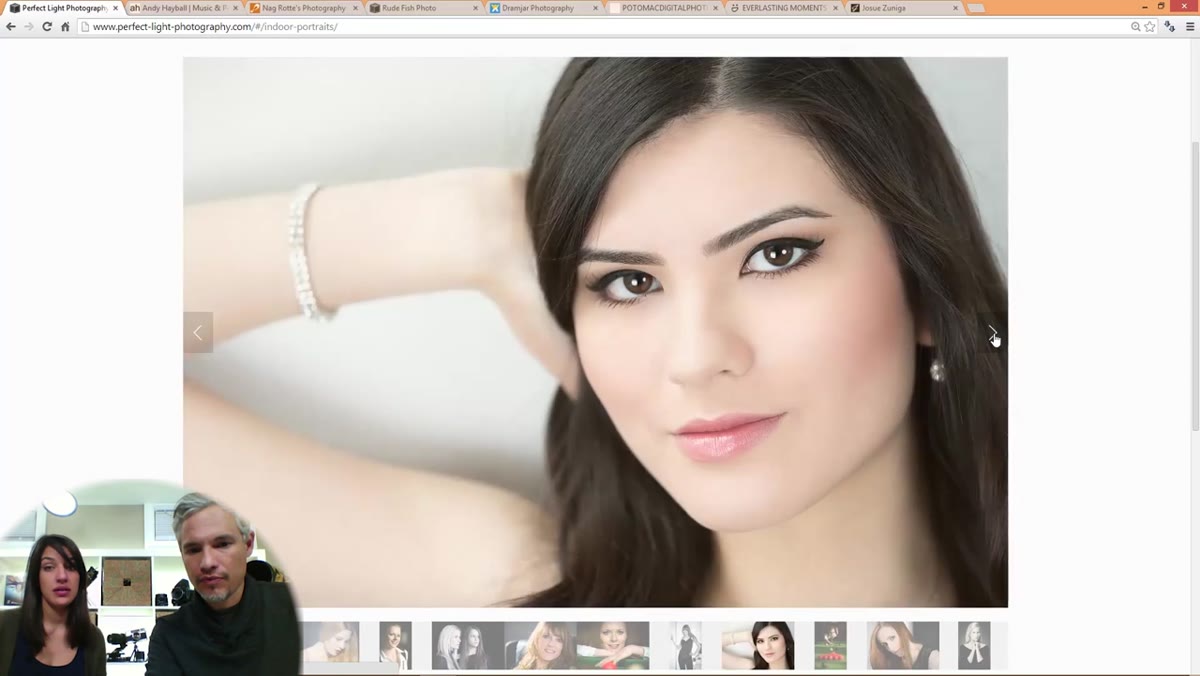
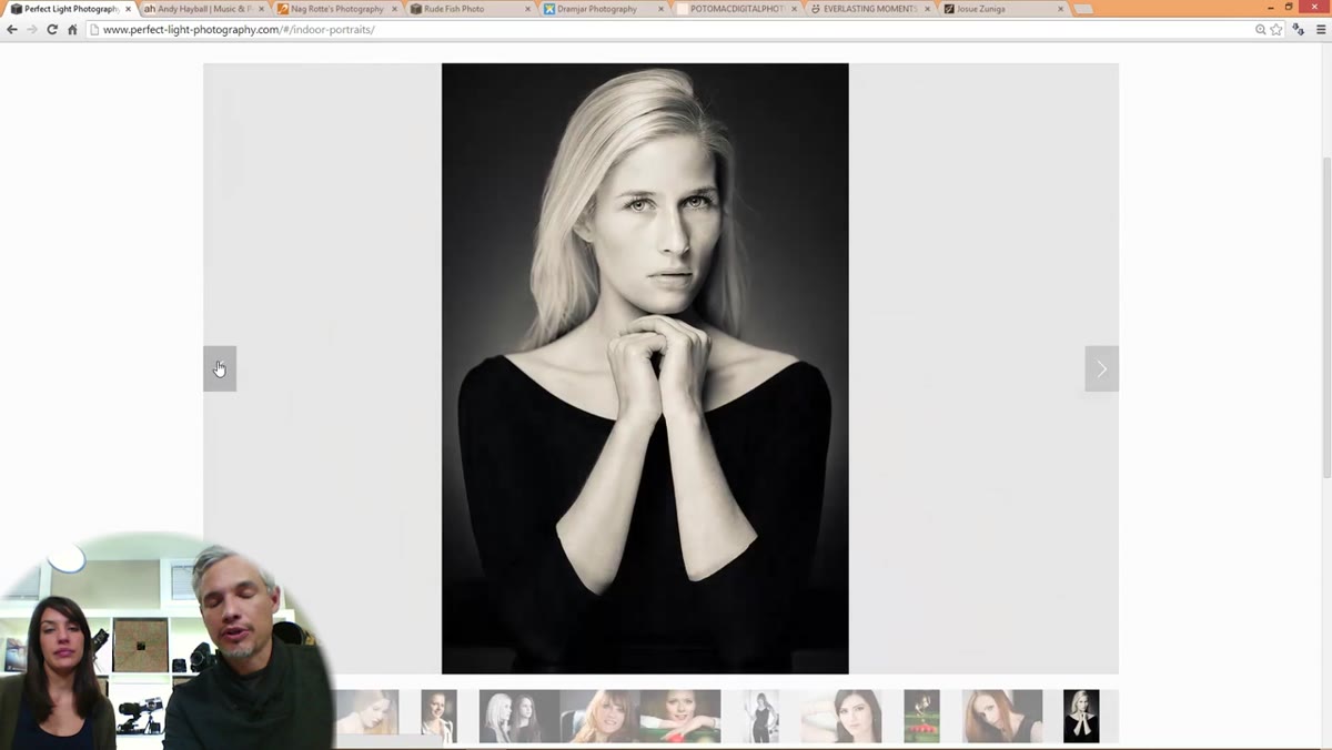 Single strong portrait image displayed full-screen during review
Tony and Chelsea spend a moment debating which image in the set is the strongest, and they land on a specific portrait they both agree is a clear tier above the rest. Here is the exercise: print out thumbnails of every image in a gallery, spread them on a table, and sort them into three piles, keep, maybe, and cut. Then ask a non-photographer friend to pick the five they’d most want hanging in their home or the five that make them want to hire that photographer immediately. Their picks and yours will not perfectly match, and the overlap is your real portfolio. The outliers in their pile, not yours, are the images you need to lead with.
Single strong portrait image displayed full-screen during review
Tony and Chelsea spend a moment debating which image in the set is the strongest, and they land on a specific portrait they both agree is a clear tier above the rest. Here is the exercise: print out thumbnails of every image in a gallery, spread them on a table, and sort them into three piles, keep, maybe, and cut. Then ask a non-photographer friend to pick the five they’d most want hanging in their home or the five that make them want to hire that photographer immediately. Their picks and yours will not perfectly match, and the overlap is your real portfolio. The outliers in their pile, not yours, are the images you need to lead with.
Step 5: Diversify Your Subjects and Avoid Model Repetition
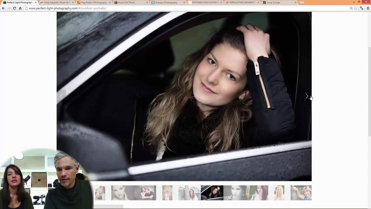 Two similar portraits of same model in same setting side by side
Tony and Chelsea flag that several images feature the same model in the same location, and the repetition reads as a limited range even if the individual shots are beautiful. For a portrait or boudoir photographer specifically, this is a credibility issue. Clients want to see that you can make a variety of real people look great, not just one person who photographs well. Audit your portfolio for repeated faces and repeated locations. If more than two images share both a subject and a setting, one of them goes. This is especially important for boudoir photographers, where prospective clients are already nervous and need to see themselves reflected in your portfolio.
Two similar portraits of same model in same setting side by side
Tony and Chelsea flag that several images feature the same model in the same location, and the repetition reads as a limited range even if the individual shots are beautiful. For a portrait or boudoir photographer specifically, this is a credibility issue. Clients want to see that you can make a variety of real people look great, not just one person who photographs well. Audit your portfolio for repeated faces and repeated locations. If more than two images share both a subject and a setting, one of them goes. This is especially important for boudoir photographers, where prospective clients are already nervous and need to see themselves reflected in your portfolio.
Step 6: Handle Sensitive Work with Taste and Intention
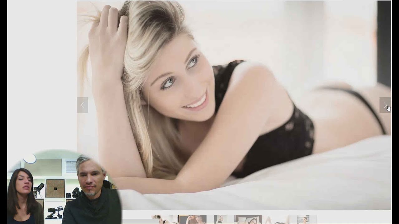
 Boudoir image shown on screen during Chelsea’s commentary
When Chelsea lands on the boudoir section, her immediate reaction is that the lead image there is tasteful, and she specifically uses that word in a positive sense. It is suggestive enough to communicate the genre clearly but composed and edited in a way that does not make her cringe. She’s seen plenty of boudoir portfolios that miss this line entirely. For photographers in this genre, taste is a business decision, not just an aesthetic one. If your boudoir images make a first-time visitor feel uncomfortable rather than intrigued, you are losing bookings to someone who calibrated that line better. Review each boudoir image and ask whether it sells the fantasy or just the body. The former books clients; the latter makes them close the tab.
Boudoir image shown on screen during Chelsea’s commentary
When Chelsea lands on the boudoir section, her immediate reaction is that the lead image there is tasteful, and she specifically uses that word in a positive sense. It is suggestive enough to communicate the genre clearly but composed and edited in a way that does not make her cringe. She’s seen plenty of boudoir portfolios that miss this line entirely. For photographers in this genre, taste is a business decision, not just an aesthetic one. If your boudoir images make a first-time visitor feel uncomfortable rather than intrigued, you are losing bookings to someone who calibrated that line better. Review each boudoir image and ask whether it sells the fantasy or just the body. The former books clients; the latter makes them close the tab.
What I’d Add From My Own Experience
The conversation in this review stays focused on image selection, which is exactly right. But there’s one layer underneath all of it that I think gets missed: portfolio editing and client conversion are directly connected, and the data shows it. After I rebuilt my portrait portfolio two years ago using almost exactly these criteria, fewer images, stronger leads, more variety in faces and settings, my inquiry-to-booking rate improved noticeably within two months. I track that number closely. The portfolio hadn’t gotten “better” in terms of the photography itself. The photography was the same. What changed was that clients could actually see themselves in the work, feel confident in my range, and not get lost in 40 images before making a decision.
If you want to test your own portfolio without waiting for someone else to review it, use a five-second test. Show your homepage to someone for exactly five seconds, then ask them what kind of photographer they think you are and what one word describes the feeling they got. If their answers don’t match your target client and your brand tone, you know exactly where to start.
The single most important takeaway from this review is simple: your portfolio is not a archive of your good work. It is a sales tool, and every image in it either earns its place or it doesn’t. Edit it like a client is making a hiring decision because they are.
Watch the full tutorial on YouTube to see Tony and Chelsea walk through this portfolio in real time. Watching them react in the moment to what they see is more instructive than any checklist.
Comments
Leave a Comment