
Every few months I sit down and audit my own portfolio like a stranger is seeing it for the first time. It is uncomfortable. It is necessary. And honestly, I am not always the best judge of my own work, which is why I pay close attention when experienced photographers do it publicly. In this Tony & Chelsea Northrup portfolio review, they bring in a guest critic named Siobhan and work through multiple portfolios spanning food photography, landscapes, and portraits. Watch the full tutorial on YouTube
What struck me most was how quickly they identified problems that photographers almost never see in their own work. Not technical failures. Navigation confusion. Lighting choices that undercut an otherwise strong image. A disconnect between what a portfolio promises and what it delivers. These are the exact things that cost you clients before they ever contact you, and they are fixable. Here is how to apply what they demonstrate.
Step 1: Open Your Portfolio as a First-Time Visitor
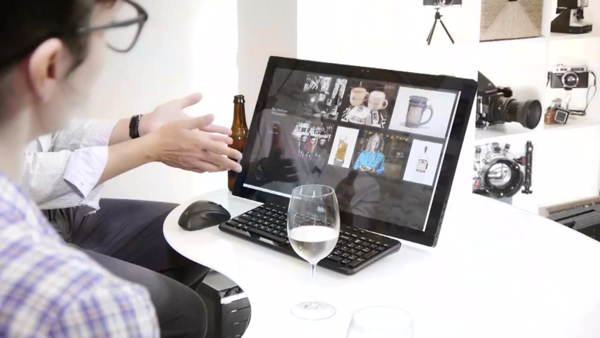 Portfolio front page showing food and drink images mixed with navigation links
Before you analyze a single image, navigate to your own portfolio homepage in an incognito browser window. Notice what story the first screen tells. In the review, the critics immediately clock that the photographer’s work skews heavily toward beverages, wine, beer, spirits, which is actually a smart niche. But the takeaway is that your front page communicates your specialty whether you intend it to or not. If you shoot weddings and food and pets with equal pride, your homepage is telling potential clients you have no specialty. That is a problem. Decide what you want to be hired for most, and make sure the front page says exactly that within five seconds.
Portfolio front page showing food and drink images mixed with navigation links
Before you analyze a single image, navigate to your own portfolio homepage in an incognito browser window. Notice what story the first screen tells. In the review, the critics immediately clock that the photographer’s work skews heavily toward beverages, wine, beer, spirits, which is actually a smart niche. But the takeaway is that your front page communicates your specialty whether you intend it to or not. If you shoot weddings and food and pets with equal pride, your homepage is telling potential clients you have no specialty. That is a problem. Decide what you want to be hired for most, and make sure the front page says exactly that within five seconds.
Step 2: Audit Your Site Navigation for Redundancy
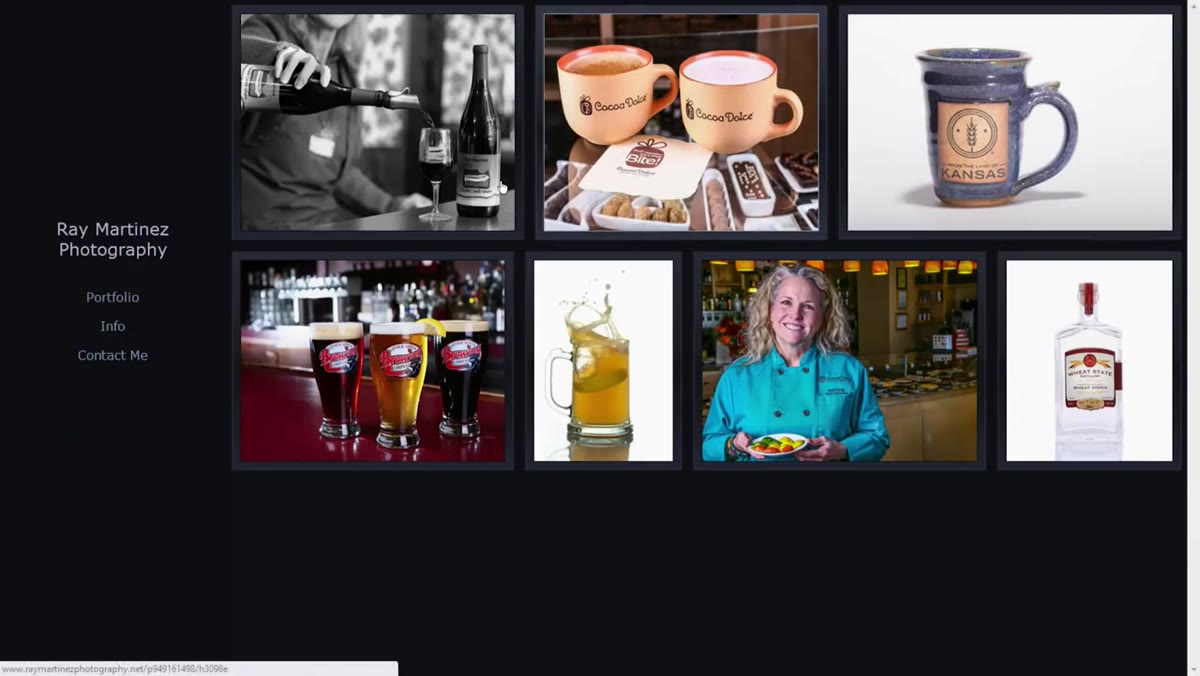 Portfolio page showing both homepage images and a separate portfolio gallery link
This is the one most photographers skip entirely. The critics point out that the portfolio being reviewed has images on the front page and then a separate portfolio link that leads to additional galleries. The result is a confusing experience where visitors are not sure where to look or what to click. Your navigation should do one job: move someone from curiosity to contact with as little friction as possible. If you have overlapping sections, collapse them. Separate links for specific categories, commercial, portrait, editorial, are far cleaner than a nested structure that makes people hunt. Audit every link and ask: does this need to exist, or am I just hoarding pages?
Portfolio page showing both homepage images and a separate portfolio gallery link
This is the one most photographers skip entirely. The critics point out that the portfolio being reviewed has images on the front page and then a separate portfolio link that leads to additional galleries. The result is a confusing experience where visitors are not sure where to look or what to click. Your navigation should do one job: move someone from curiosity to contact with as little friction as possible. If you have overlapping sections, collapse them. Separate links for specific categories, commercial, portrait, editorial, are far cleaner than a nested structure that makes people hunt. Audit every link and ask: does this need to exist, or am I just hoarding pages?
Step 3: Evaluate Each Image for Lighting Completeness
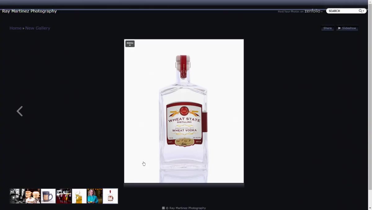 Food and beverage shots displayed in the commercial gallery
The critics give high marks to the food and restaurant images overall but flag a specific bottle shot for lacking a kicker light. With reflective surfaces, glass, bottles, glassware, a side or rim light creates a highlight along the edge that gives the subject shape and dimension. Without it, even a sharp, well-exposed bottle photo can look flat. Before you submit a commercial food image to your portfolio, ask yourself whether every surface reads the way it should. Specular highlights on glass tell the viewer what they are looking at. If the shape of the object is not obvious in the photo, the lighting is not finished.
Food and beverage shots displayed in the commercial gallery
The critics give high marks to the food and restaurant images overall but flag a specific bottle shot for lacking a kicker light. With reflective surfaces, glass, bottles, glassware, a side or rim light creates a highlight along the edge that gives the subject shape and dimension. Without it, even a sharp, well-exposed bottle photo can look flat. Before you submit a commercial food image to your portfolio, ask yourself whether every surface reads the way it should. Specular highlights on glass tell the viewer what they are looking at. If the shape of the object is not obvious in the photo, the lighting is not finished.
Step 4: Learn When to Leave a Retouching Idea Alone
 Portrait shot taken in natural window light with slight background clutter
One of the most honest moments in the review comes when they look at a portrait and one critic suggests selecting the background and blurring it in post to reduce distraction, then immediately walks it back because the mask would be too complex to execute cleanly. This is real professional thinking. Knowing when a fix will cost more in time and quality than it saves is a skill. If a background blur requires a technically difficult selection around flyaway hair or complex edges, the artifact risk is high and clients notice. Either reshoot with a wider aperture or leave the image out of the portfolio. A technically flawed retouch is more damaging than imperfect backgrounds.
Portrait shot taken in natural window light with slight background clutter
One of the most honest moments in the review comes when they look at a portrait and one critic suggests selecting the background and blurring it in post to reduce distraction, then immediately walks it back because the mask would be too complex to execute cleanly. This is real professional thinking. Knowing when a fix will cost more in time and quality than it saves is a skill. If a background blur requires a technically difficult selection around flyaway hair or complex edges, the artifact risk is high and clients notice. Either reshoot with a wider aperture or leave the image out of the portfolio. A technically flawed retouch is more damaging than imperfect backgrounds.
Step 5: Check That Every Portfolio Image Makes the Viewer Want Something
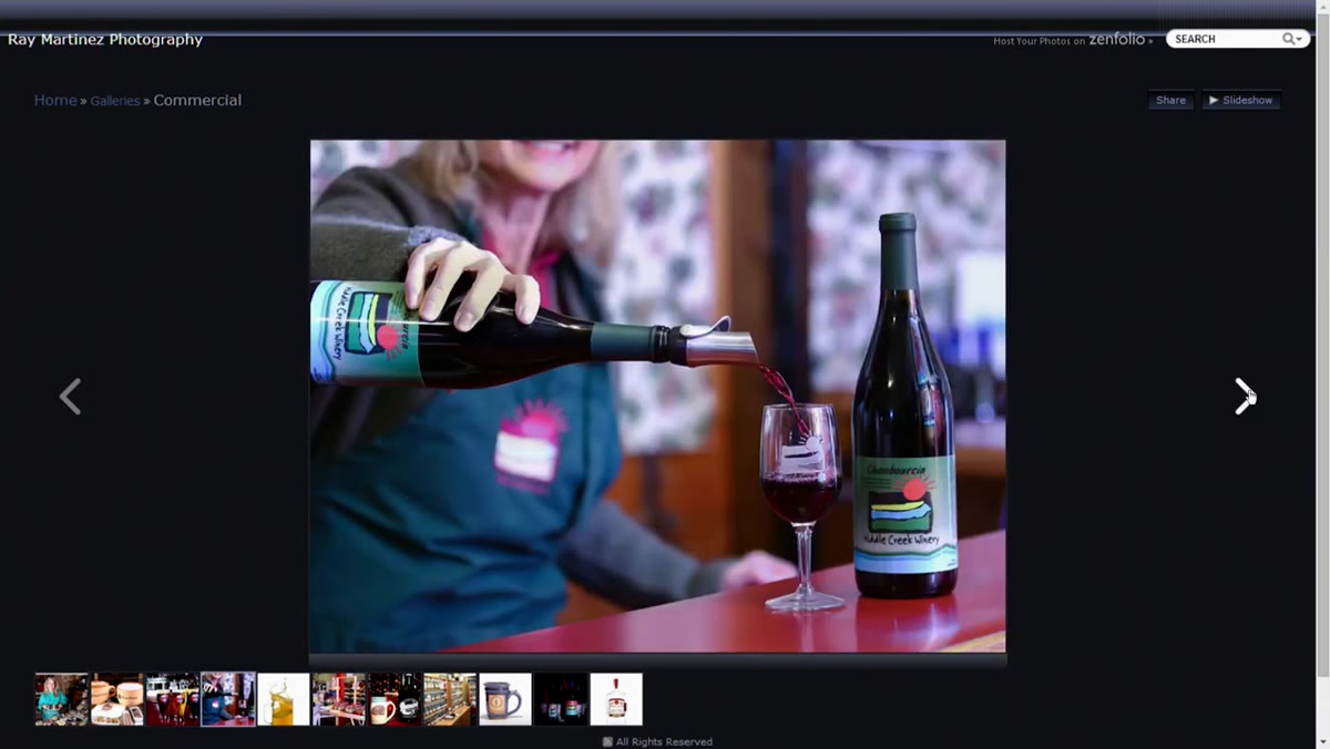 Clean, appetizing food photos with good context and styling
The critics use a simple and repeatable test on the food images: do these make you want to go to the restaurant? Several images pass immediately. That is the only bar that matters for commercial food photography. Your portfolio images are not art entries. They are sales tools for clients who need to know you can make their product irresistible. Run every commercial image through this filter. Beverage: does it make you thirsty? Restaurant interior: does it feel warm and inviting? Product: does it look like something worth buying? If the honest answer is no, the image should not be in the portfolio regardless of technical quality.
Clean, appetizing food photos with good context and styling
The critics use a simple and repeatable test on the food images: do these make you want to go to the restaurant? Several images pass immediately. That is the only bar that matters for commercial food photography. Your portfolio images are not art entries. They are sales tools for clients who need to know you can make their product irresistible. Run every commercial image through this filter. Beverage: does it make you thirsty? Restaurant interior: does it feel warm and inviting? Product: does it look like something worth buying? If the honest answer is no, the image should not be in the portfolio regardless of technical quality.
Step 6: Watch for Navigation and Gallery Behavior That Works Against You
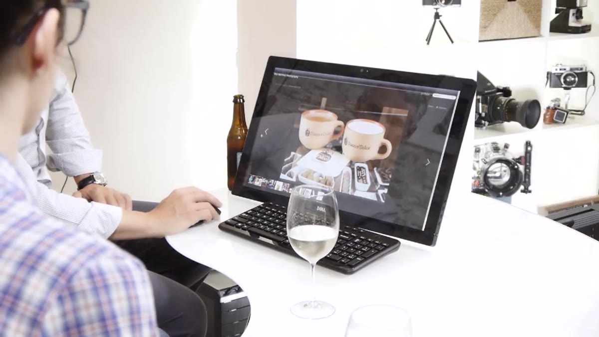
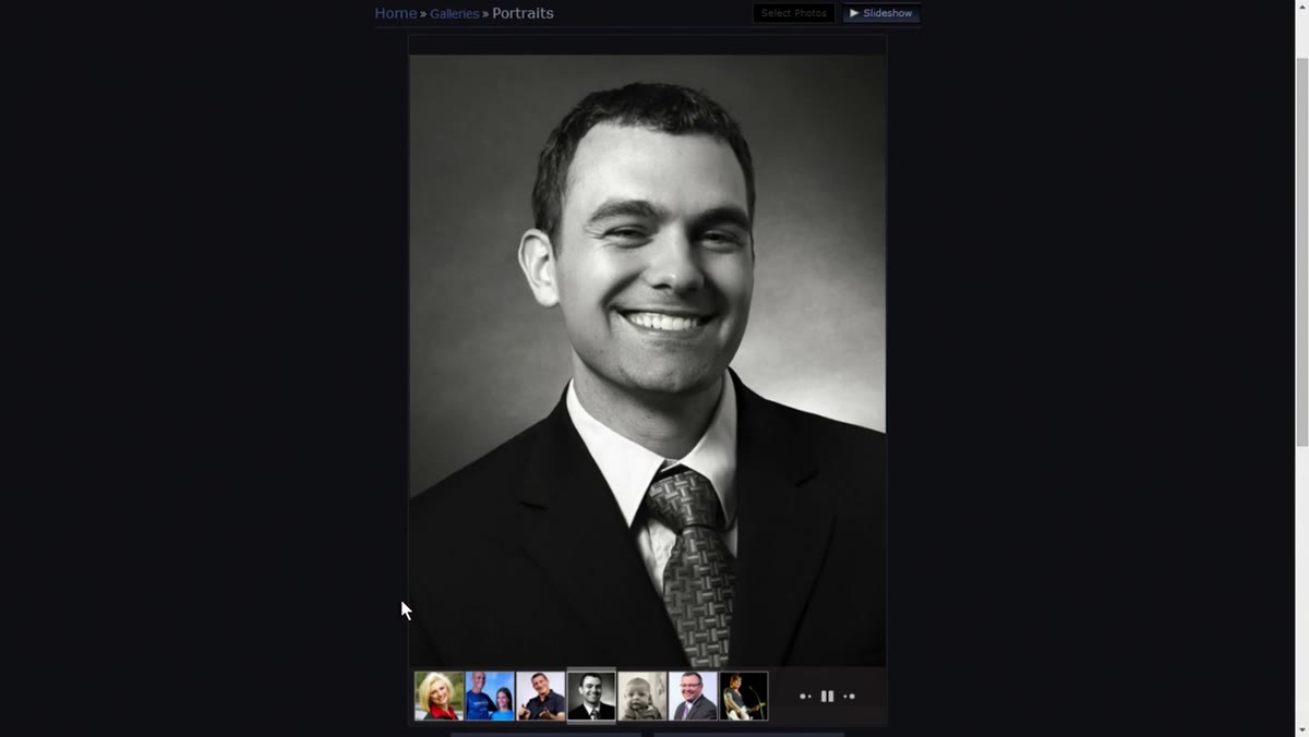 Gallery switching to auto-advance mode unexpectedly during review
Toward the end of the segment, the gallery shifts into an automatic slideshow mode the critics did not choose, and they note they preferred having manual control. This is a small thing with a large impact. When your gallery auto-advances, you take control away from the client. People stop on images that speak to them. They go back. They linger. Auto-advance interrupts that process and often moves someone past the image that would have closed the deal. Test every gallery interaction on your site. Make sure default behavior respects the user’s pace.
Gallery switching to auto-advance mode unexpectedly during review
Toward the end of the segment, the gallery shifts into an automatic slideshow mode the critics did not choose, and they note they preferred having manual control. This is a small thing with a large impact. When your gallery auto-advances, you take control away from the client. People stop on images that speak to them. They go back. They linger. Auto-advance interrupts that process and often moves someone past the image that would have closed the deal. Test every gallery interaction on your site. Make sure default behavior respects the user’s pace.
What I Add to This Process in My Own Studio
I run a portrait studio, so the commercial food critique does not apply to me directly, but the underlying principle does. Every six months I export my full portfolio image list into a spreadsheet and tag each image with one of three labels: strong, filler, or dated. Strong images stay. Filler images, the ones I included because I needed to fill a row or a category, come out. Dated images, technically fine but no longer representative of my current quality, come out too. The goal is a portfolio where every single image is doing active work. Right now my portfolio sits at 22 images across four galleries. That is it. When I cut it down from 40, my inquiry rate went up. Fewer images, stronger signal.
The single most important thing I took from this review is something the critics demonstrate without naming it directly: the best commercial portfolios do not show everything the photographer can do. They show one thing done exceptionally well, repeatedly, at a high enough level that the right client has no reason to look anywhere else. Tighten the work, clean up the navigation, fix the lighting gaps, and then let the portfolio do the selling.
Watch the full tutorial on YouTube to see the full portfolio critiques across food, landscape, and portrait work, including the specific images being discussed.
Comments (2)
Bookmarked. Coming back to this one for sure.
Great article! I actually covered something related on my site — the landscape angle is really complementary to this.
Leave a Comment