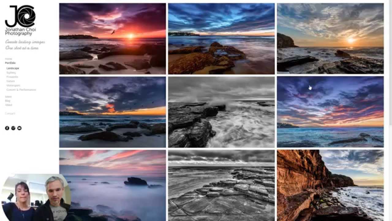
I have a 47-item client experience checklist. I built it after years of watching small details cost photographers real money, including myself early on. So when I sat down to watch the third installment of Tony and Chelsea Northrup’s portfolio review series, I was nodding along within the first two minutes. Not because they were saying anything shocking, but because they were naming the exact friction points that make potential clients quietly close a browser tab and move on.
Watch the full tutorial on YouTube
What makes this review series genuinely useful is that Tony and Chelsea are not critiquing photography in a vacuum. They’re evaluating portfolios the way a prospective client would experience them, which is a completely different lens than most photographers use when they build their own sites. If you have a portfolio live right now, treat this walkthrough like a working audit. Pull up your site in one tab and read this in the other.
Step 1: Clarify What Your Portfolio Is Actually Selling
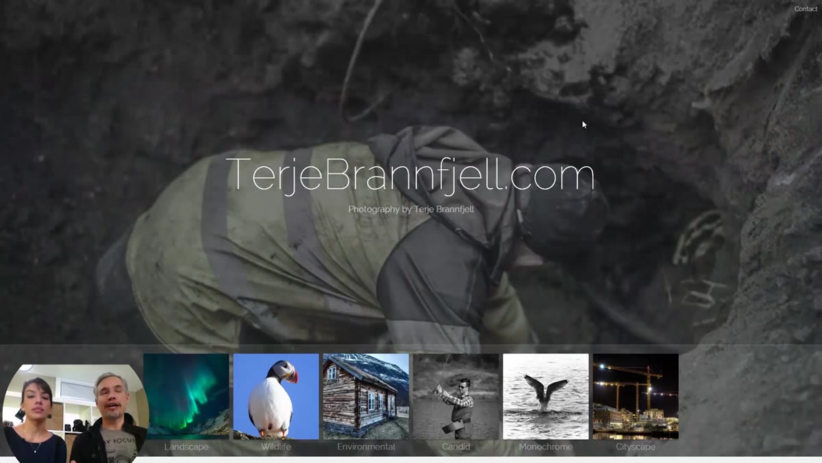 Tony explaining fine art vs. portrait portfolio evaluation criteria
Before you change a single pixel, you need to identify whether your portfolio exists to sell services or to sell prints. These are two different goals and they demand different structures. A fine art portfolio earns trust through visual cohesion and artistic identity. A service-based portrait portfolio earns bookings by showing clients exactly what they’ll get when they hire you. Mixing the two without intention creates confusion, and confused visitors don’t convert.
Tony explaining fine art vs. portrait portfolio evaluation criteria
Before you change a single pixel, you need to identify whether your portfolio exists to sell services or to sell prints. These are two different goals and they demand different structures. A fine art portfolio earns trust through visual cohesion and artistic identity. A service-based portrait portfolio earns bookings by showing clients exactly what they’ll get when they hire you. Mixing the two without intention creates confusion, and confused visitors don’t convert.
Ask yourself: what action do I want someone to take after viewing my portfolio? If the answer is “book a session,” your site needs to be structured around that conversion. If it’s “buy a print,” your gallery and checkout flow need to be the hero. Get clear on this before you evaluate anything else.
Step 2: Put Your Email Address on Your Contact Page
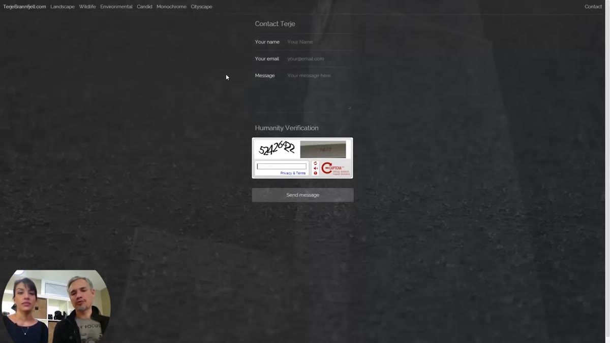 Contact page shown with only a form, no email address visible
This one made me laugh because I see it constantly. Tony and Chelsea flagged a portfolio where the contact page had only a form with no visible email address. One of them quoted someone from Twitter who said it feels like a slap in the face to a potential client. That’s not hyperbole. When someone is ready to reach out and all they see is a form with no human behind it, the trust evaporates.
Contact page shown with only a form, no email address visible
This one made me laugh because I see it constantly. Tony and Chelsea flagged a portfolio where the contact page had only a form with no visible email address. One of them quoted someone from Twitter who said it feels like a slap in the face to a potential client. That’s not hyperbole. When someone is ready to reach out and all they see is a form with no human behind it, the trust evaporates.
Your email address being public does mean spam bots will find it. Use Gmail or any modern mail provider and their filters will handle the noise. The upside, which is that real clients can reach you directly, is worth far more than the minor annoyance of a spam folder you never have to think about. List your email address on your contact page. Full stop.
Step 3: Keep Your Navigation Consistent on Every Page
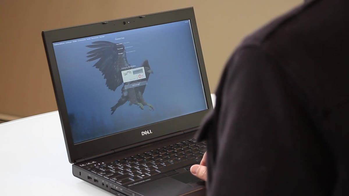 Navigation shifting position between pages on the reviewed portfolio
Tony pointed out that on the portfolio being reviewed, the navigation links moved from the bottom of the page to the top when a visitor clicked through to the contact page. That might sound minor. It is not minor. When a site’s layout shifts between pages, visitors have to re-orient themselves every time they click. That cognitive friction signals unprofessionalism, even if the viewer can’t articulate why they feel uneasy.
Navigation shifting position between pages on the reviewed portfolio
Tony pointed out that on the portfolio being reviewed, the navigation links moved from the bottom of the page to the top when a visitor clicked through to the contact page. That might sound minor. It is not minor. When a site’s layout shifts between pages, visitors have to re-orient themselves every time they click. That cognitive friction signals unprofessionalism, even if the viewer can’t articulate why they feel uneasy.
Run through every page of your website right now and confirm that your navigation lives in the same position, uses the same labels, and behaves the same way across all of them. If you’re using a template that does something inconsistent on certain pages, find a fix or switch templates. This is non-negotiable for trust.
Step 4: Title Every Image, or Title None of Them
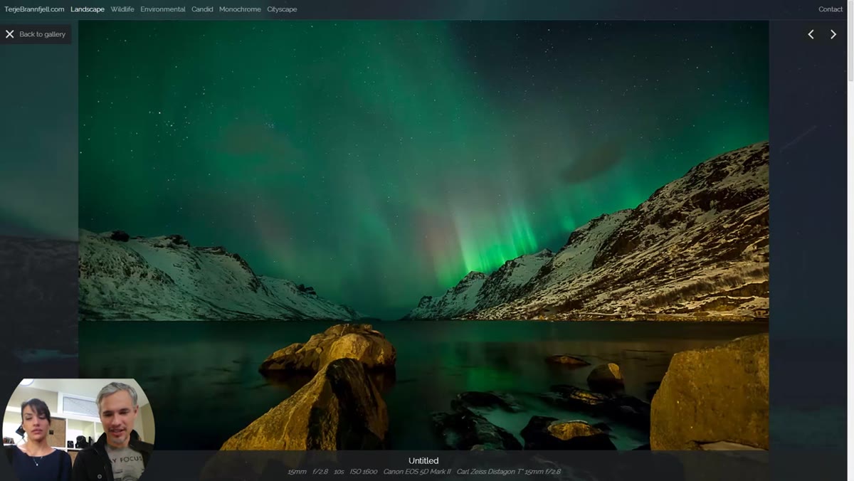 Gallery view showing two images both labeled “Untitled”
The reviewed portfolio had multiple images listed as “Untitled.” Chelsea caught it immediately. If you’re going to give your images titles, give them real ones. If you’re not going to title them, remove the title field entirely. “Untitled” is not neutral. It reads as unfinished, like you meant to come back and never did. For a fine art portfolio especially, a title adds context and emotional framing that helps a print buyer connect with the work.
Gallery view showing two images both labeled “Untitled”
The reviewed portfolio had multiple images listed as “Untitled.” Chelsea caught it immediately. If you’re going to give your images titles, give them real ones. If you’re not going to title them, remove the title field entirely. “Untitled” is not neutral. It reads as unfinished, like you meant to come back and never did. For a fine art portfolio especially, a title adds context and emotional framing that helps a print buyer connect with the work.
For service photographers, this also applies to gallery categories and page headings. Vague or placeholder text anywhere on your site chips away at the polished impression you’re trying to make.
Step 5: Lead With Your Strongest Image
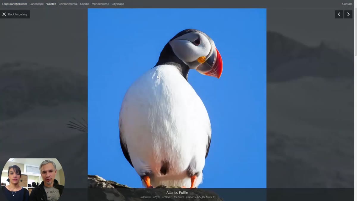 First wildlife image praised as the portfolio’s best, placed correctly at the top
Tony and Chelsea noticed that the very first wildlife image in the portfolio was the strongest one in the entire collection, and they gave the photographer credit for that instinct. Your lead image carries enormous weight. It sets the expectation for everything that follows. If a weaker image opens your gallery, viewers mentally downgrade the quality of everything they see after it, even the strong work.
First wildlife image praised as the portfolio’s best, placed correctly at the top
Tony and Chelsea noticed that the very first wildlife image in the portfolio was the strongest one in the entire collection, and they gave the photographer credit for that instinct. Your lead image carries enormous weight. It sets the expectation for everything that follows. If a weaker image opens your gallery, viewers mentally downgrade the quality of everything they see after it, even the strong work.
Most photographers are not objective judges of their own best images. Show your top five candidates to someone who will be honest with you, not your spouse or your best friend. Pick the image that creates the strongest immediate reaction and put it first, every time.
Step 6: One Image Per Subject, Not One Per Shoot
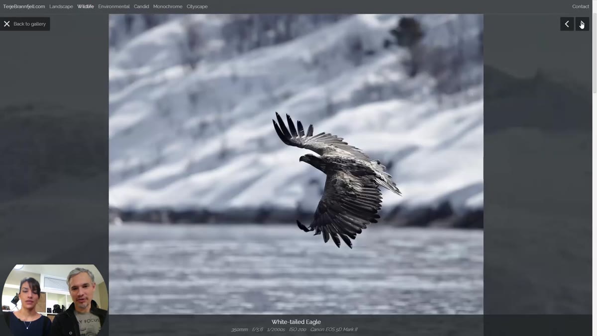 Multiple puffin photos shown in wildlife gallery, Tony recommending one per species
This is the edit that most photographers resist the most. The reviewed portfolio had several puffin photos, multiple eagle shots, and other groupings where the photographer clearly had affection for a subject and wanted to show off multiple captures. Tony’s rule is clean: one image per species in a wildlife portfolio. The principle extends across every genre. One image per location, one image per type of pose in a portrait gallery.
Multiple puffin photos shown in wildlife gallery, Tony recommending one per species
This is the edit that most photographers resist the most. The reviewed portfolio had several puffin photos, multiple eagle shots, and other groupings where the photographer clearly had affection for a subject and wanted to show off multiple captures. Tony’s rule is clean: one image per species in a wildlife portfolio. The principle extends across every genre. One image per location, one image per type of pose in a portrait gallery.
Your portfolio is not a proof gallery. It is a curated argument that you are the right photographer to hire or to buy from. Every redundant image dilutes that argument. Cut harder than feels comfortable. The photographers whose portfolios stop visitors in their tracks are almost always the ones who were ruthless editors.
Step 7: Use Cropping to Fix Composition Before You Publish
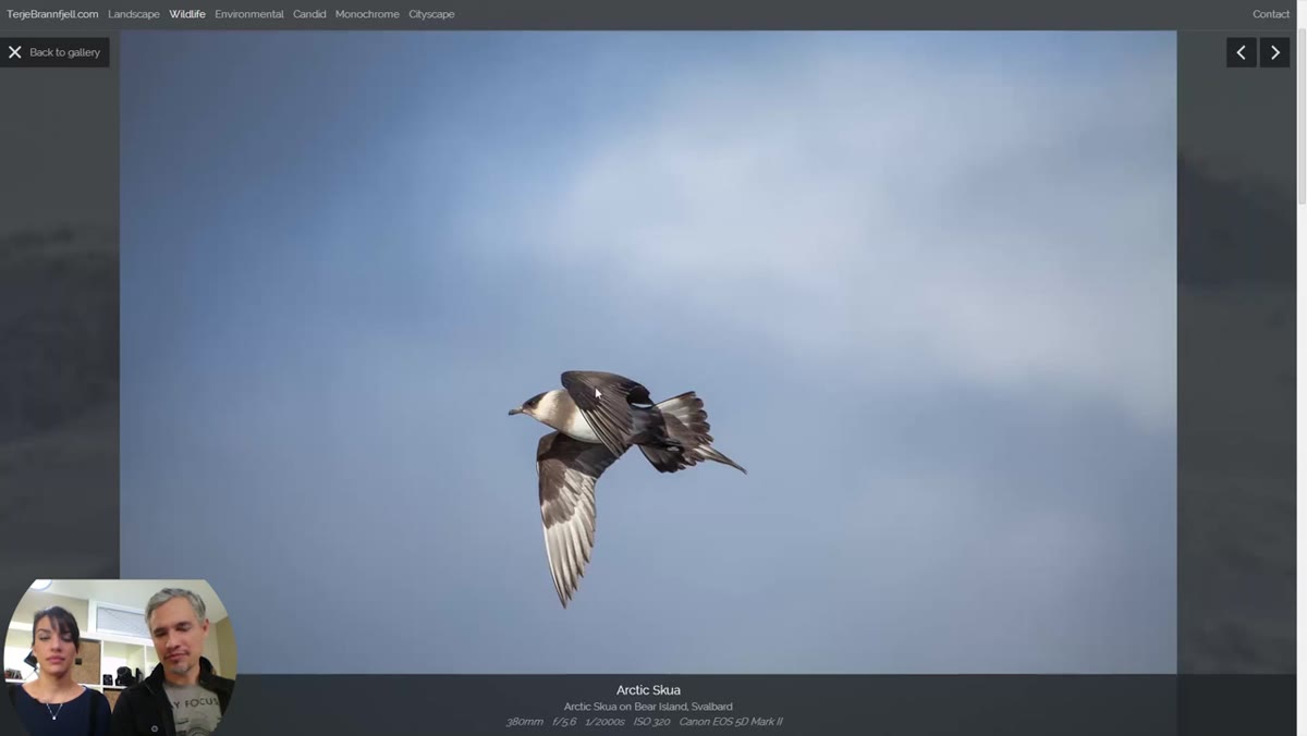 Tight critique of an image violating rule of space, needing a crop
Tony flagged an image in the wildlife section that violated the rule of space, meaning the subject was facing into the edge of the frame rather than into open space, which creates visual tension that feels wrong even to viewers who couldn’t name the rule. His fix was simple: crop it. Not every composition problem requires a reshoot. Sometimes the image you have is 80% of the way to strong and a crop will get it there.
Tight critique of an image violating rule of space, needing a crop
Tony flagged an image in the wildlife section that violated the rule of space, meaning the subject was facing into the edge of the frame rather than into open space, which creates visual tension that feels wrong even to viewers who couldn’t name the rule. His fix was simple: crop it. Not every composition problem requires a reshoot. Sometimes the image you have is 80% of the way to strong and a crop will get it there.
Before any image goes into your public portfolio, zoom out and ask whether the composition serves the subject. Check the rule of thirds, check breathing room around your subject, and check whether anything in the frame is competing for attention. A tight, intentional crop often beats a wider shot with distracting edges.
What I’d Add From Running My Own Studio
The checklist Tony mentions in the video is a smart idea, and it reminded me of something I learned the hard way: your portfolio review should happen on a schedule, not just when you feel like it. I review my studio website every quarter. I pull up analytics, look at which gallery pages have the highest exit rates, and treat those pages as problems to solve. A high exit rate on a gallery page usually means the images aren’t strong enough or the page is loading slowly, both of which are fixable.
Your website is not a finished product. It’s a living business asset, and it deserves the same ongoing attention you give your camera gear.
The single most important takeaway from this review is that your portfolio isn’t being judged on your photography alone. It’s being judged on every detail a client encounters from the moment they land on your homepage to the moment they decide whether to fill out your contact form. Fix the form. Fix the navigation. Cut the weak images. Give every photo a real title or none at all.
Watch the full tutorial on YouTube and run your own site through this audit this week. The photographers who book more clients are rarely the ones with the most impressive cameras. They’re the ones whose websites make it easy to say yes.
Comments (12)
Wow, I had no idea you could do this. Mind blown.
The tip about what tony chelseas portfolio r was the missing piece for me. Thank you.
This is the kind of content that keeps me coming back.
This is fantastic. I've been recommending this approach to my readers too.
Just subscribed. If the rest of your content is this good, I'm in.
My workflow just got 10x faster. Not even kidding.
This is fantastic. I've been recommending this approach to my readers too.
This is the kind of content that keeps me coming back.
Wow, I had no idea you could do this. Mind blown.
Tried this technique this morning. Game changer for real.
Great article! I actually covered something related on my site — the photoshop angle is really complementary to this.
Would love to see a follow-up going deeper into this topic.
Leave a Comment