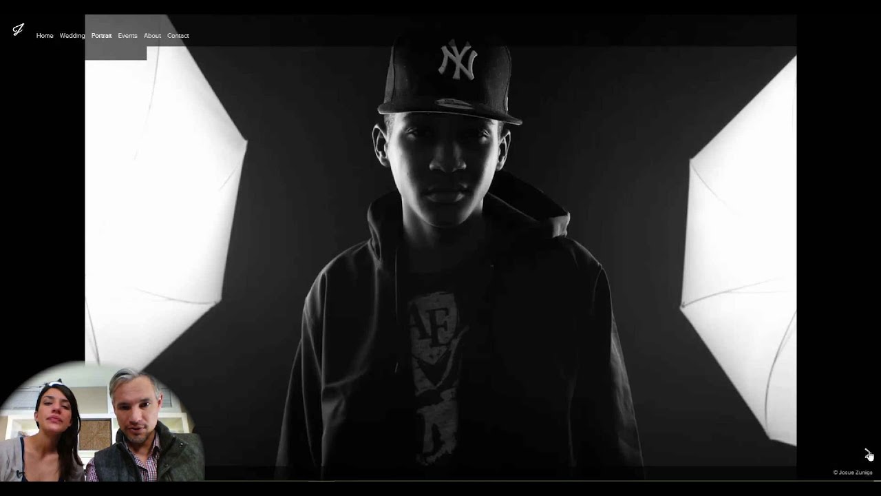
Every few months I sit down and audit my own studio website the way a stranger would see it. Not as someone who knows what the work took, or what the light was doing that morning, or how long I spent getting that kid to actually smile. As someone who landed on the page with zero context and maybe thirty seconds of patience. It is uncomfortable every time, and every time I find something that needs to go.
That exercise is exactly what Tony and Chelsea Northrup model in their portfolio review series, and their approach has influenced how I coach photographers in my business workshops. Watch the full tutorial on YouTube to see the live critique in action. In this Tony & Chelsea Northrup tutorial, they walk through six real photographer portfolios and call out both the wins and the friction points with the kind of bluntness most of us need but rarely get from people who know us personally. The re-review segment is especially instructive because you can see what actually changes when a photographer takes feedback seriously and what still gets left on the table.
What follows is my breakdown of the core lessons from the session, structured so you can apply each one to your own site today.
Step 1: Look at Your Homepage as a First Impression, Not a Gallery
 Homepage of Capture Kings portfolio redesign on screen
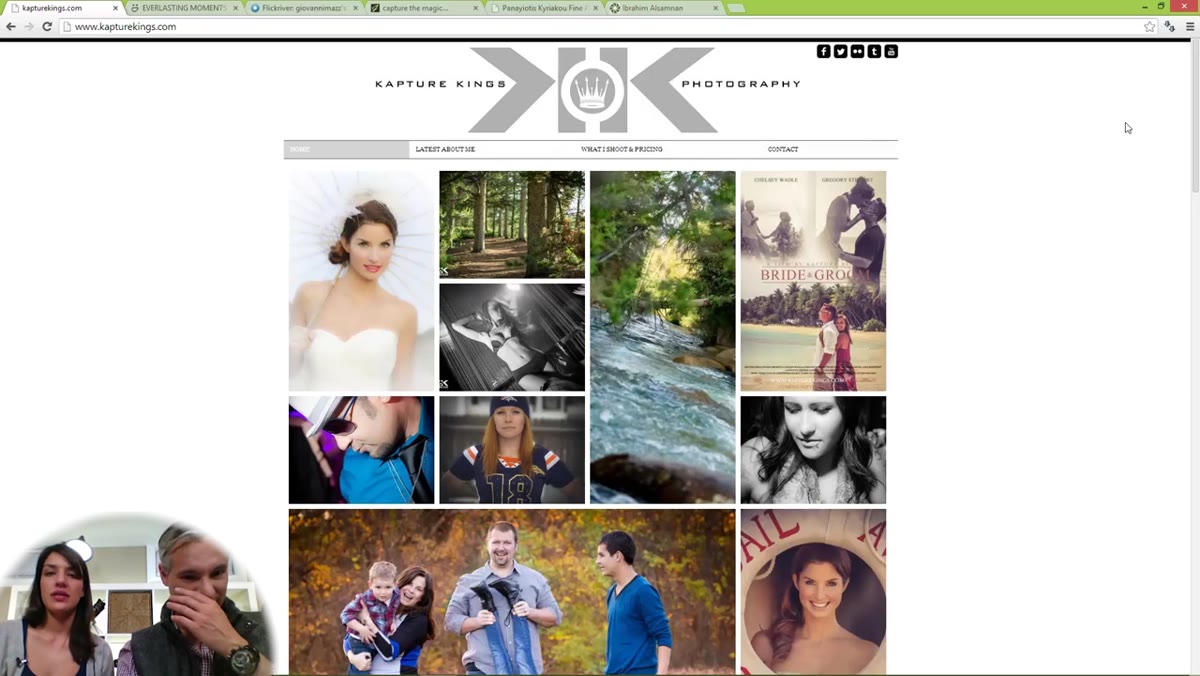
Before you evaluate any individual photo, step back and ask whether your homepage communicates professionalism within the first three seconds. Tony and Chelsea open the re-review of Capture Kings by immediately noting that the redesign looks significantly better, specifically calling out the logo, the layout, and the fact that the images do not jam every pixel of the screen. Restraint is a design decision. A clean, breathable layout signals that the photographer has taste and editorial judgment, which is exactly what portrait clients are hiring for.
Homepage of Capture Kings portfolio redesign on screen
Before you evaluate any individual photo, step back and ask whether your homepage communicates professionalism within the first three seconds. Tony and Chelsea open the re-review of Capture Kings by immediately noting that the redesign looks significantly better, specifically calling out the logo, the layout, and the fact that the images do not jam every pixel of the screen. Restraint is a design decision. A clean, breathable layout signals that the photographer has taste and editorial judgment, which is exactly what portrait clients are hiring for.
Look at your homepage on your phone, on a tablet, and on a desktop in a browser you do not normally use. Does the logo render cleanly at every size? Is there enough whitespace that the images can actually breathe? If your homepage looks like a grid of every photo you have ever taken, it is working against you.
Step 2: Cull Your Portfolio Harder Than Feels Comfortable
 Chelsea pointing out weaker thumbnail images in the portfolio grid
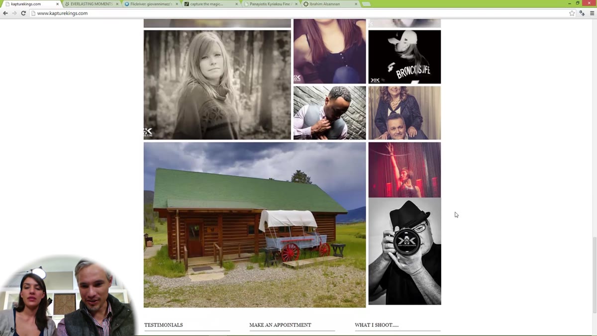
This is the step most photographers resist, and it is the one that makes the biggest difference. Chelsea walks through the Capture Kings homepage grid and identifies specific images that dilute the overall quality: a couple of forest shots that do not make compelling thumbnails, a wide landscape element that loses all impact at small size, and a few images that simply do not match the caliber of the strongest work on the page. Her point is not that these are bad photographs. The point is that one weak thumbnail lowers the perceived ceiling of everything around it.
Chelsea pointing out weaker thumbnail images in the portfolio grid
This is the step most photographers resist, and it is the one that makes the biggest difference. Chelsea walks through the Capture Kings homepage grid and identifies specific images that dilute the overall quality: a couple of forest shots that do not make compelling thumbnails, a wide landscape element that loses all impact at small size, and a few images that simply do not match the caliber of the strongest work on the page. Her point is not that these are bad photographs. The point is that one weak thumbnail lowers the perceived ceiling of everything around it.
A practical way to do this: print your grid thumbnails at roughly two inches square, the size they appear on a phone screen. Cover up the ones you are unsure about and ask yourself whether the remaining images still tell a coherent story. If the covered images were doing nothing, remove them. If they were carrying essential context, figure out whether a tighter crop or a different image could do that job better. Your portfolio is only as strong as its weakest included photo.
Step 3: Only Show Work You Actually Want to Be Hired to Reproduce
 Discussion of tree and forest photos that won’t attract portrait clients
Tony makes a point here that I have repeated in every workshop I have run: the images in your portfolio are a job application for more of the same work. If you include forest landscapes because you love them but you are building a portrait business, you are confusing your prospective clients about what you actually do. Nobody is going to call you and say “I have some woods, would you mind photographing my trees?” That sounds like a joke, but I have watched photographers include motorcycle shots, pet portraits, and abstract macros on a wedding photography homepage and then wonder why their inquiries are scattered and their conversion rate is low.
Discussion of tree and forest photos that won’t attract portrait clients
Tony makes a point here that I have repeated in every workshop I have run: the images in your portfolio are a job application for more of the same work. If you include forest landscapes because you love them but you are building a portrait business, you are confusing your prospective clients about what you actually do. Nobody is going to call you and say “I have some woods, would you mind photographing my trees?” That sounds like a joke, but I have watched photographers include motorcycle shots, pet portraits, and abstract macros on a wedding photography homepage and then wonder why their inquiries are scattered and their conversion rate is low.
Every image in your portfolio should be one you would be genuinely excited to recreate for a paying client. If you would not want to do that session again, the photo does not belong in the portfolio even if it is technically excellent.
Step 4: Include a Real Photo of Yourself
 Capture Kings about page showing photographer’s own portrait
Tony and Chelsea specifically applaud the fact that Capture Kings ends his homepage with a photo of himself and has a picture on his About page. They flag this as a positive every time they see it, which tells you how often portfolios omit it entirely. Clients are hiring a person, not a camera. A professional headshot on your About page lowers the psychological barrier to reaching out because the person on the other end of that contact form is no longer abstract.
Capture Kings about page showing photographer’s own portrait
Tony and Chelsea specifically applaud the fact that Capture Kings ends his homepage with a photo of himself and has a picture on his About page. They flag this as a positive every time they see it, which tells you how often portfolios omit it entirely. Clients are hiring a person, not a camera. A professional headshot on your About page lowers the psychological barrier to reaching out because the person on the other end of that contact form is no longer abstract.
This does not need to be elaborate. A single well-lit photo of you holding your camera, or working with a client, or even just looking directly at the camera with a genuine expression, is enough. Have a photographer friend shoot it, or set up your own camera on a timer. The absence of your face on a service-based website is a quiet but real trust gap.
Step 5: Put Your Prices on Your Website
 Pricing section visible in Capture Kings navigation menu
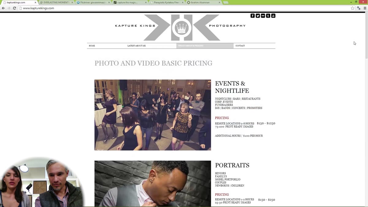
Tony and Chelsea pause on the pricing page and note its presence approvingly with no additional comment needed. That small moment is worth sitting with. Pricing on your website filters out tire-kickers, saves you hours of back-and-forth email, and signals confidence in the value of your work. Photographers who hide their prices often do so because they are afraid of scaring away clients. What they are actually doing is scaring away the clients who were ready to book and frustrating everyone else.
Pricing section visible in Capture Kings navigation menu
Tony and Chelsea pause on the pricing page and note its presence approvingly with no additional comment needed. That small moment is worth sitting with. Pricing on your website filters out tire-kickers, saves you hours of back-and-forth email, and signals confidence in the value of your work. Photographers who hide their prices often do so because they are afraid of scaring away clients. What they are actually doing is scaring away the clients who were ready to book and frustrating everyone else.
You do not need to list every package permutation. A clear starting price, a description of what is included, and a next step for custom inquiries is enough. “Portraits starting at $450” tells a prospective client whether they are in the right place in under two seconds.
Step 6: Make Your Contact Information Effortless to Find
 Contact section showing phone number and clickable email address
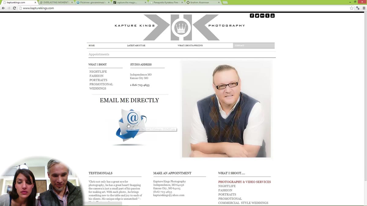
Tony clicks through the contact section and confirms that the phone number and email are present and that the email link is clickable. This sounds basic but it gets missed more often than you would think. Run through your own contact page right now and verify: does your email address open a mail client when clicked on mobile? Does your phone number trigger a call on a smartphone? Is your contact page reachable from every other page, not just the main navigation?
Contact section showing phone number and clickable email address
Tony clicks through the contact section and confirms that the phone number and email are present and that the email link is clickable. This sounds basic but it gets missed more often than you would think. Run through your own contact page right now and verify: does your email address open a mail client when clicked on mobile? Does your phone number trigger a call on a smartphone? Is your contact page reachable from every other page, not just the main navigation?
I track where studio inquiries drop off, and a surprising number of people who visit a contact page still do not submit a form. A visible phone number and a clickable email give those people an alternative path. Do not make someone work to give you money.
What I’d Add From Running a Studio Full-Time
The Northrups focus on what is visible, which is the right place to start. But after years of running my own portrait studio, I would add one layer to the culling conversation: track which images in your portfolio actually get mentioned by clients who book. I started asking new clients during their intake call what they saw on my website that made them reach out. The answers surprised me. The images I was most proud of artistically were rarely the ones that converted. The images that converted were the ones that clearly showed a client what their own session could look like. Portfolio culling is not just about quality. It is about relevance to the specific client you are trying to attract.
The single most important thing you can take from this review session is that your portfolio is a sales tool first and an art exhibition second. Every image should earn its place by pulling the right clients toward you. If it is not doing that job, it is doing the opposite.
Watch the full tutorial on YouTube to see all six portfolio critiques and hear Tony and Chelsea work through each site in real time. The live format is worth watching because you can see how quickly a first impression forms, which is the same speed your future clients are judging your work.
Comments (6)
My workflow just got 10x faster. Not even kidding.
The before and after really sells it. Incredible difference.
Well explained. I think my audience would really benefit from this — mind if I link to it?
Never thought of approaching it this way. Really creative.
I tried this on a client project yesterday and the results were way better than expected.
Great article! I actually covered something related on my site — the landscape angle is really complementary to this.
Leave a Comment