Marketing
Why Your Instagram Isn't Booking Clients (And the Posting Schedule That Actually Fixed Mine)
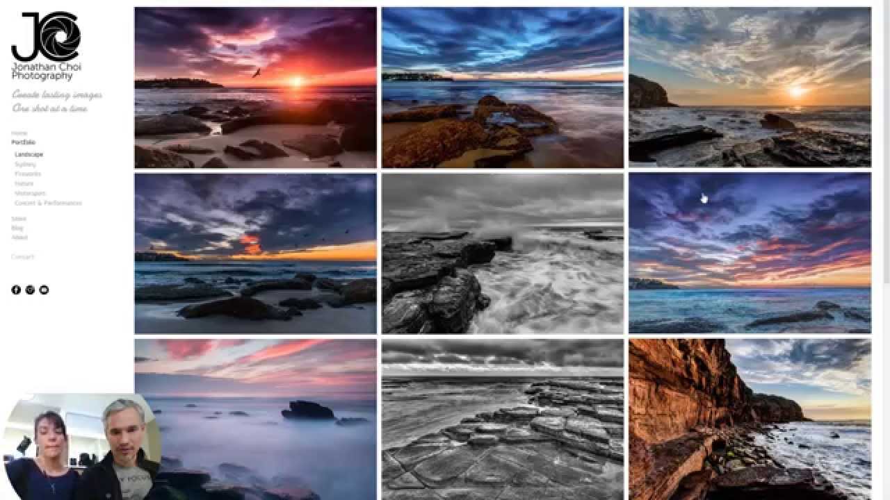
I spent 14 months posting to Instagram every single day. Beautiful images, consistent aesthetic, thoughtful captions. My follower count climbed. My inquiry rate stayed flat. I was essentially running a free gallery for people who had no intention of hiring me, and I was burning time I didn’t have to do it. That’s the trap most photographers fall into, and it’s not a creativity problem. It’s a strategy problem. The Algorithm Isn’t Your Enemy, But It’s Not Your Friend Either Here’s what’s actually happening when you post: Instagram’s algorithm is optimizing for time spent on the platform, not for your conversion rate.