Every year I watch talented photographers lose clients not because their work is weak, but because their marketing looks like an afterthought. A blurry Canva flyer, a PDF thrown together in Word, a price list that reads like a grocery receipt. I was guilty of this too, early on. My photography was solid. My marketing made it look amateur.
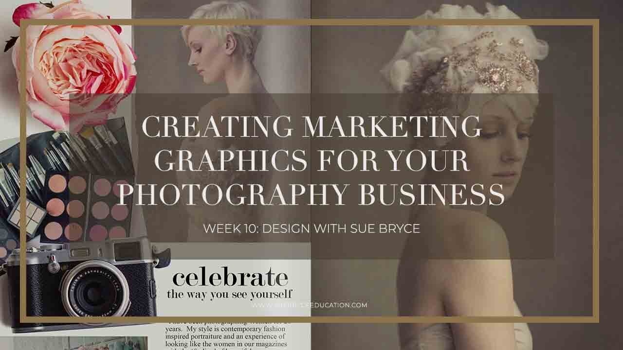
That changed when I started treating my marketing materials the same way I treat a shoot: with intention, preparation, and a clear vision of what I want the client to feel. Watch the full tutorial on YouTube - this session from The Portrait System’s Design Week series, led by Sue Bryce alongside graphic designer and photographer Shawna, is one of the most practical walkthroughs I’ve found for photographers who want polished marketing materials but don’t have a design background. Sue is refreshingly honest: she’s not a natural designer, but she can execute beautifully when she follows a clear process. That’s the whole point.
The tutorial is framed around building a marketing PDF from scratch, the kind of document you’d send to a prospective client, use as a studio guide, or drop into an email follow-up sequence. Here’s how the process breaks down, and what I took away from each stage.
Step 1: Define the Purpose Before You Open Any Software
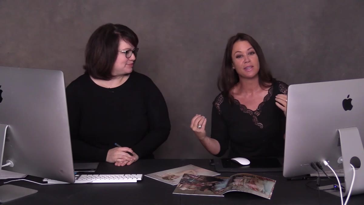
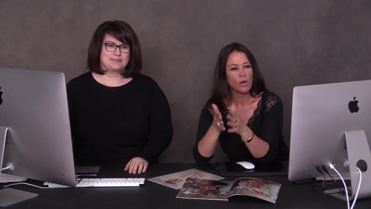 Sue explaining the goal of creating a marketing PDF
Before touching a design tool, get clear on what this document is supposed to do. Is it a welcome guide? A service menu? A follow-up piece for leads who haven’t booked? Sue and Shawna make the case that most photographers skip this step entirely, which is why their PDFs end up as shapeless blobs of information. Your document needs one job. One audience. One call to action. Write that down before you open Canva, InDesign, or whatever tool you’re using.
Sue explaining the goal of creating a marketing PDF
Before touching a design tool, get clear on what this document is supposed to do. Is it a welcome guide? A service menu? A follow-up piece for leads who haven’t booked? Sue and Shawna make the case that most photographers skip this step entirely, which is why their PDFs end up as shapeless blobs of information. Your document needs one job. One audience. One call to action. Write that down before you open Canva, InDesign, or whatever tool you’re using.
For a startup portrait studio, I’d recommend your first marketing PDF be a client experience guide, something that walks a new inquiry through what working with you actually looks like. It pre-answers objections, sets expectations, and makes you look like you’ve done this a hundred times even if you’re still in your first year.
Step 2: Gather Your Brand Assets First
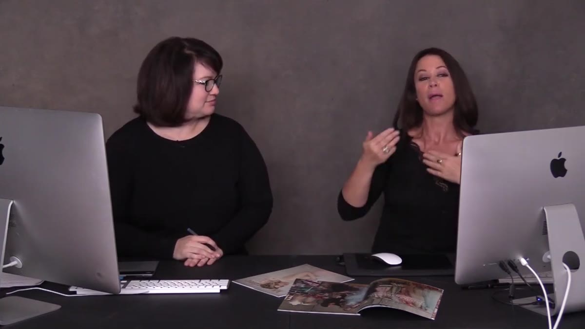
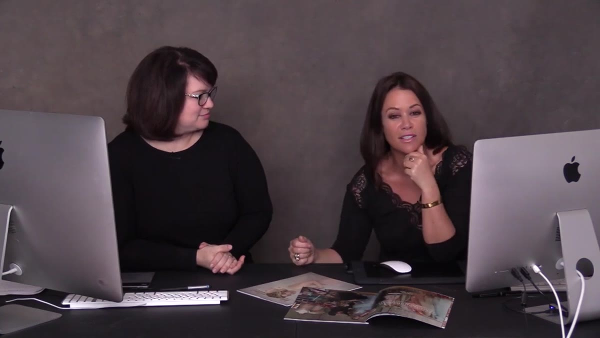 Discussion of visual brand elements and design background
Before you lay out a single text box, pull together everything you’ll need: your logo in a high-resolution format, your brand color hex codes, your two or three brand fonts, and a curated selection of your best images. Shawna emphasizes this as foundational. Designers don’t start from a blank page, they start from a set of constraints. Those constraints are your brand.
Discussion of visual brand elements and design background
Before you lay out a single text box, pull together everything you’ll need: your logo in a high-resolution format, your brand color hex codes, your two or three brand fonts, and a curated selection of your best images. Shawna emphasizes this as foundational. Designers don’t start from a blank page, they start from a set of constraints. Those constraints are your brand.
If you don’t have official hex codes yet, pull three colors from one of your favorite portrait images. Use a free color picker tool online. Consistency matters far more than perfection here. One clean font pairing, two or three colors max, and images that all feel like they belong in the same world.
Step 3: Choose a Layout That Matches Your Client’s Experience
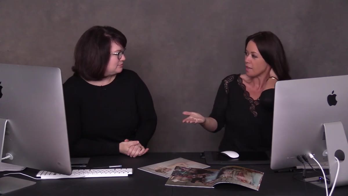
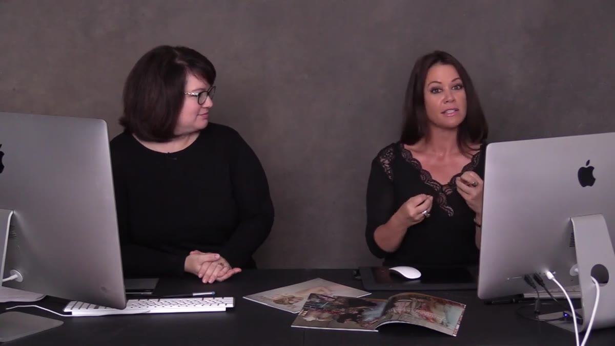 Shawna describing layout approach for portrait photography marketing
The layout of your PDF communicates something before a single word is read. A crowded, text-heavy page says “I’m nervous and I’m trying to explain everything.” A clean page with one strong image and a few lines of copy says “I’m confident, and I trust my work to speak.” Sue and Shawna walk through how a graphic design sensibility directly informs portrait photography, and vice versa. If you’ve ever looked at a beautifully designed editorial spread, that’s the energy you want in a client-facing PDF.
Shawna describing layout approach for portrait photography marketing
The layout of your PDF communicates something before a single word is read. A crowded, text-heavy page says “I’m nervous and I’m trying to explain everything.” A clean page with one strong image and a few lines of copy says “I’m confident, and I trust my work to speak.” Sue and Shawna walk through how a graphic design sensibility directly informs portrait photography, and vice versa. If you’ve ever looked at a beautifully designed editorial spread, that’s the energy you want in a client-facing PDF.
Start with a simple two-column grid. Left side: image. Right side: text. This alone will make your document look more intentional than 90% of what photographers are sending out. Don’t try to fill every inch of the page. White space is not empty space, it’s breathing room, and it signals confidence.
Step 4: Write Copy That Sounds Like You, Not a Brochure
 Sue discussing marketing focus and connecting with clients at startup level
Design can only carry a weak message so far. The copy inside your marketing PDF needs to speak directly to the client you want to attract. Sue’s whole ethos in the 12-week startup framework is about going back to basics and being explicit, not assuming your client knows what a “luxury portrait experience” means or why they should invest in one. Say it plainly. Who is this for? What will they walk away with? What do they need to do next?
Sue discussing marketing focus and connecting with clients at startup level
Design can only carry a weak message so far. The copy inside your marketing PDF needs to speak directly to the client you want to attract. Sue’s whole ethos in the 12-week startup framework is about going back to basics and being explicit, not assuming your client knows what a “luxury portrait experience” means or why they should invest in one. Say it plainly. Who is this for? What will they walk away with? What do they need to do next?
Keep your copy short. Each page should have no more than 80-100 words of body text. Use headlines that are benefit-driven, not just descriptive. Instead of “Our Process,” try “Here’s What Happens After You Book.” Instead of “Investment,” try “What Your Session Includes.” Small language shifts do more work than a full redesign.
Step 5: Build It as a Repeatable Template, Not a One-Off Document
 Sue emphasizing startup systems and repeatable processes for photographers
One of the most valuable points in this tutorial is the emphasis on systems. Sue talks explicitly about the difference between doing something once and building something you can use again. When you design your marketing PDF, you’re not just making a document. You’re making a template. Set up master pages or locked background elements so that updating the content later takes twenty minutes, not two hours.
Sue emphasizing startup systems and repeatable processes for photographers
One of the most valuable points in this tutorial is the emphasis on systems. Sue talks explicitly about the difference between doing something once and building something you can use again. When you design your marketing PDF, you’re not just making a document. You’re making a template. Set up master pages or locked background elements so that updating the content later takes twenty minutes, not two hours.
In Canva, this means using their “template” save feature and locking your brand elements on a background layer. In Adobe InDesign, set up paragraph styles and master page layouts before you start placing content. Either way, the first build takes time. Every version after that is fast.
Step 6: Export and Test Before You Send It Anywhere
 Shawna demonstrating the design output and final document format
Export your PDF at print quality even if you’re only sending it digitally. A low-resolution PDF looks cheap on a retina screen and it looks worse when a client prints it at home, which they will if they’re seriously considering booking you. In Canva, choose “PDF Print” as your export format. In InDesign, use the PDF/X-1a preset or a high-quality print preset. Check the file size. If it’s over 10MB, compress it. Tools like Smallpdf or Adobe Acrobat’s built-in compressor work well.
Shawna demonstrating the design output and final document format
Export your PDF at print quality even if you’re only sending it digitally. A low-resolution PDF looks cheap on a retina screen and it looks worse when a client prints it at home, which they will if they’re seriously considering booking you. In Canva, choose “PDF Print” as your export format. In InDesign, use the PDF/X-1a preset or a high-quality print preset. Check the file size. If it’s over 10MB, compress it. Tools like Smallpdf or Adobe Acrobat’s built-in compressor work well.
Then send it to yourself and open it on your phone. That’s how most clients will see it. If it reads well on a phone screen, you’re ready to send.
What I’d Add From My Own Experience
The tutorial focuses on the design and execution side, which is exactly what most photographers need. What I’d layer on top is a distribution system. A beautiful PDF that sits in a folder on your desktop does nothing. Build a simple automated email sequence that sends this document to every new inquiry within five minutes of their first contact. I use a basic CRM tool that triggers the send automatically. Response rates on my inquiry follow-ups went up noticeably after I combined a polished PDF with faster delivery. The design earns trust. The speed shows you’re organized. Clients notice both.
The single most important thing this tutorial reinforced for me: your marketing materials are a direct reflection of your client experience before anyone has even booked with you. If your PDF looks scattered, clients assume your studio will feel the same way. If it looks clean, intentional, and confident, you’ve already started delivering the experience you’re promising.
Watch the full tutorial on YouTube and pay close attention to how Sue and Shawna talk about the relationship between design thinking and photography. It’s a pairing that should show up in everything you put in front of a client.
Comments
Leave a Comment